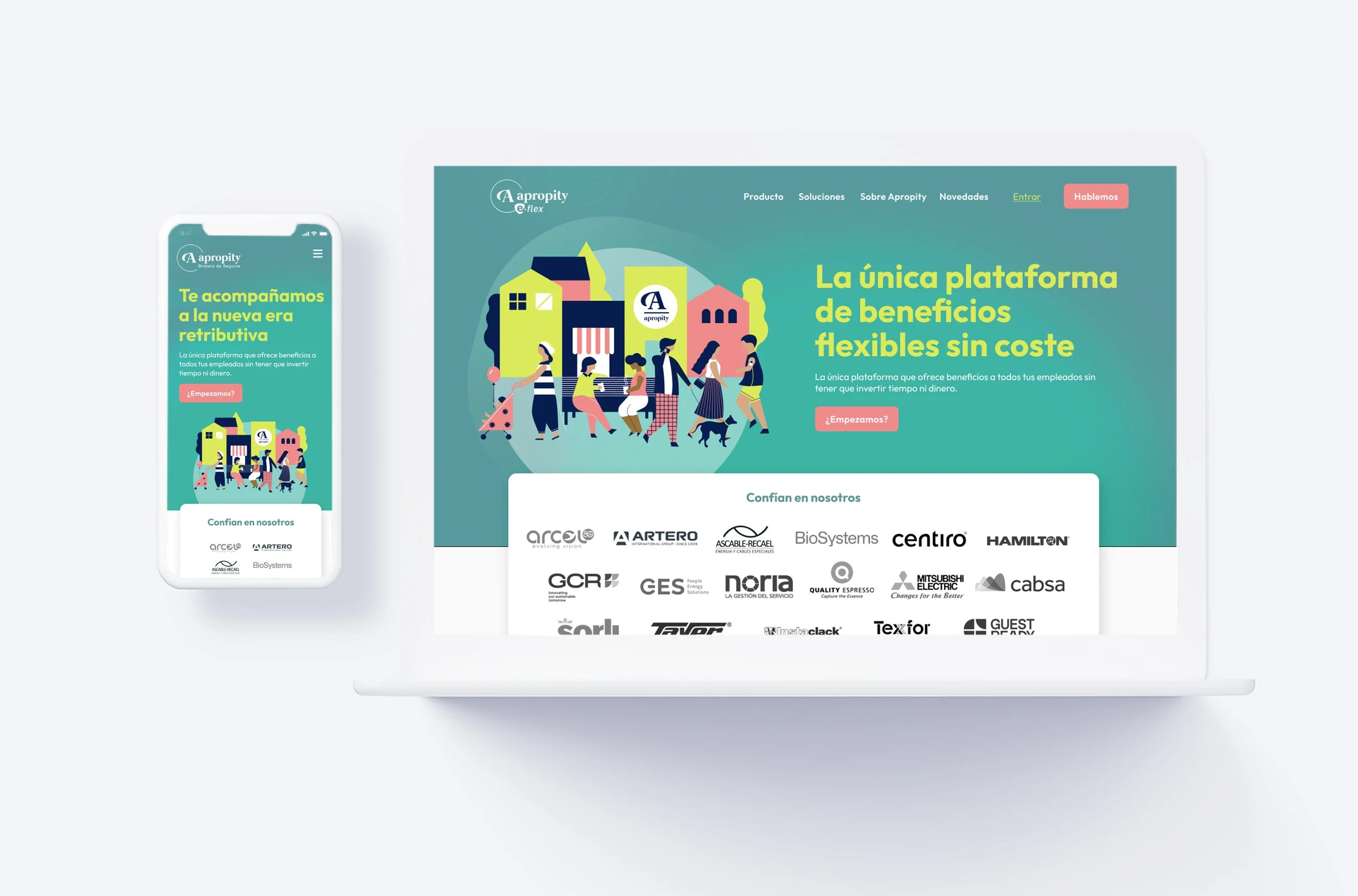
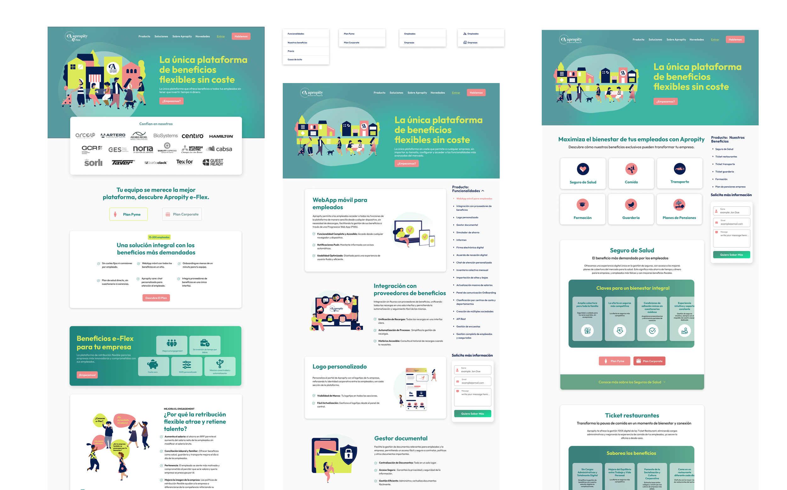
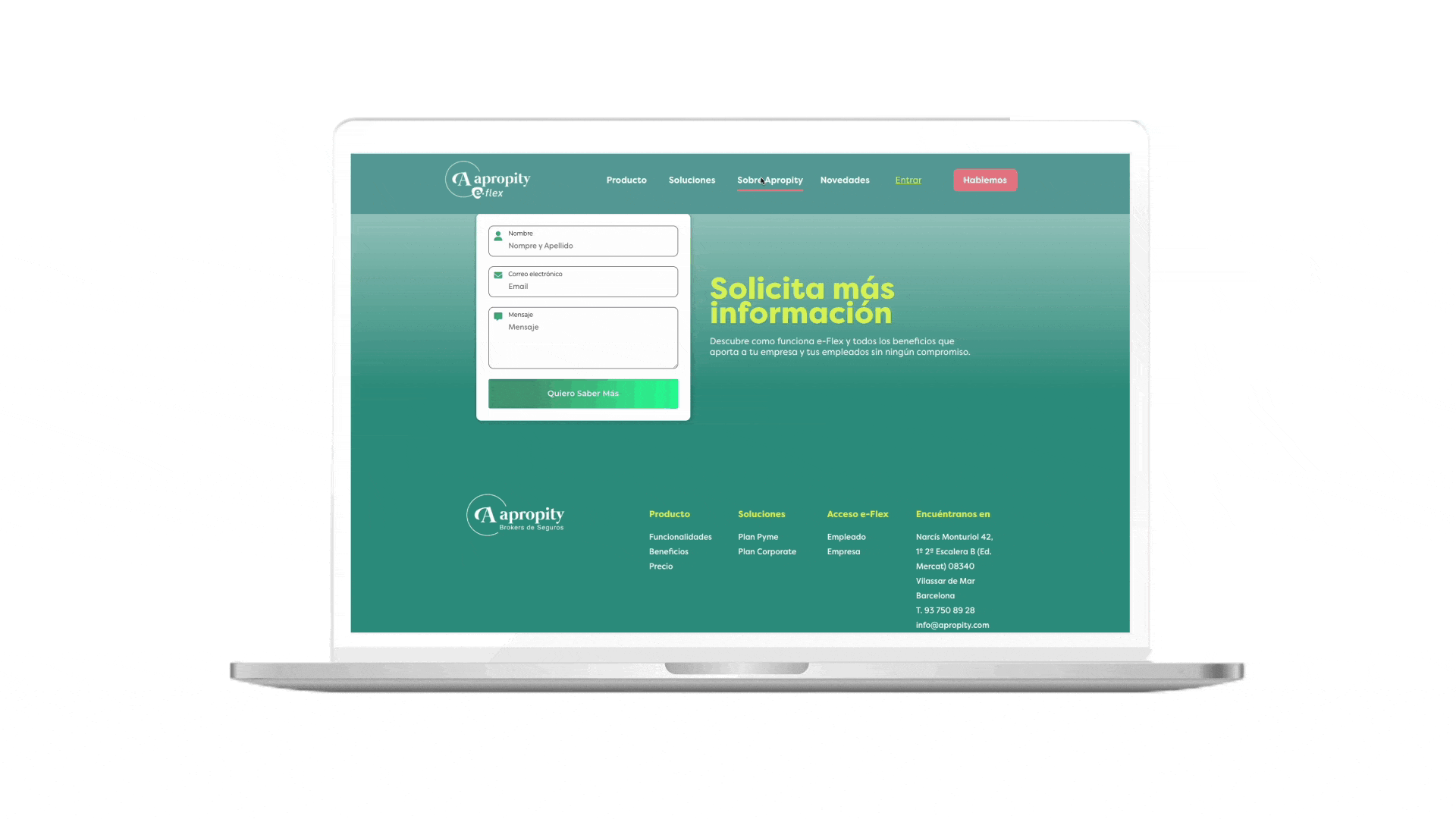
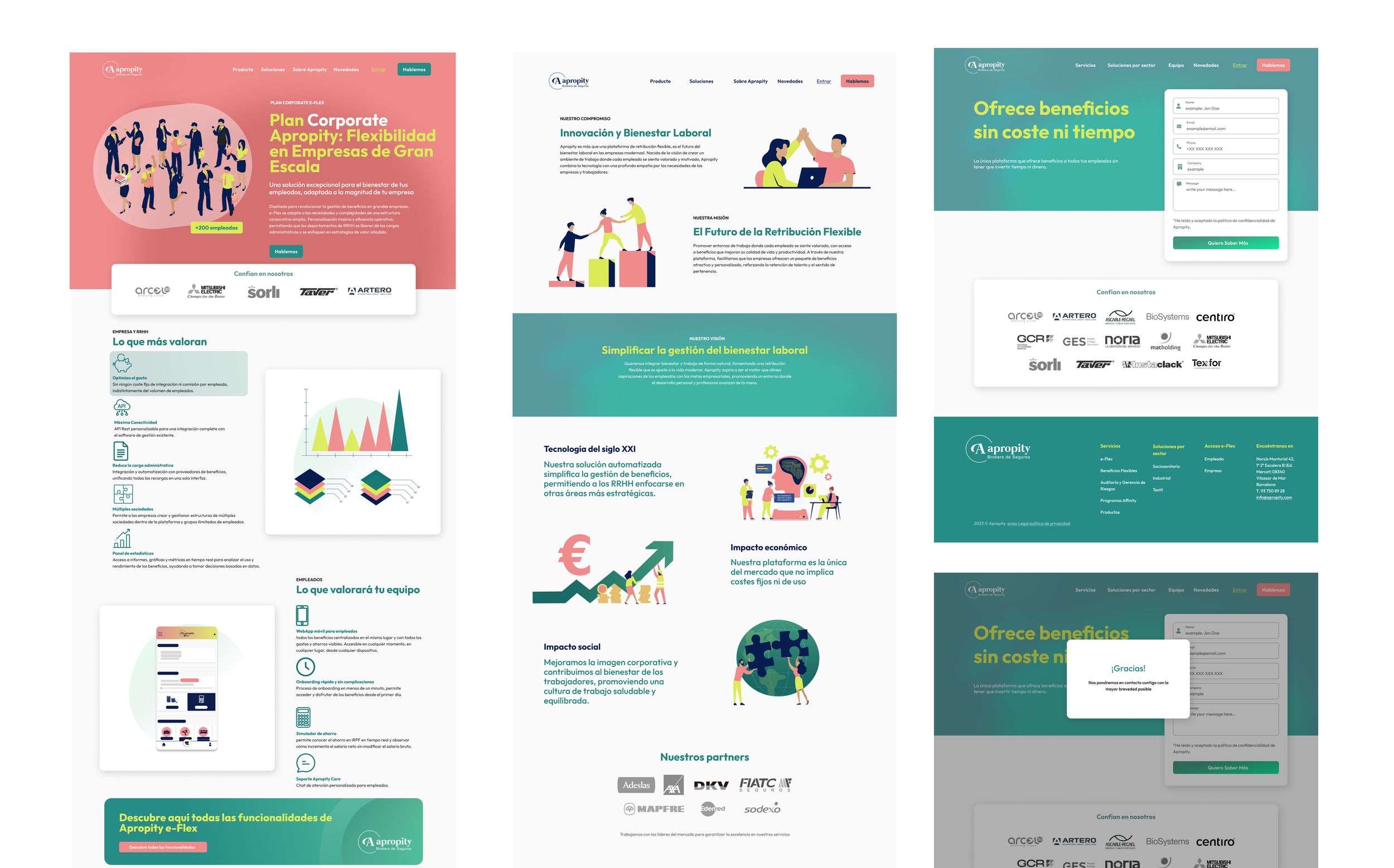
The Apropity website needed a fresher and more modern image, and following their branding, this was the solution I proposed. They were still in transition with the light blue website and wanted to integrate their new colors: green, pink, and blue (consistent with their illustrations), and this is how the project turned out.


Apropity: Platform E-flex
UI WEB REDESIGN
Team
Role
UI Design
Rebranding
IxD Design
Web Design
Client
AIDDA
Apropity
Time
4 weeks