
GooApps Ventures: Break the Gap

UI WEB DESIGN

Landing page design for GooApps Ventures, a program supporting innovative health and sports startups. I focused on high-fidelity UI, enhancing the existing design system to create a bold, minimal, and visually striking web presence.
Time
Role
UI Design
Client
GooApps
3 days
Overview
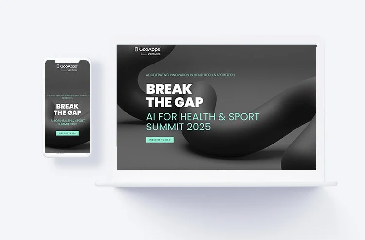
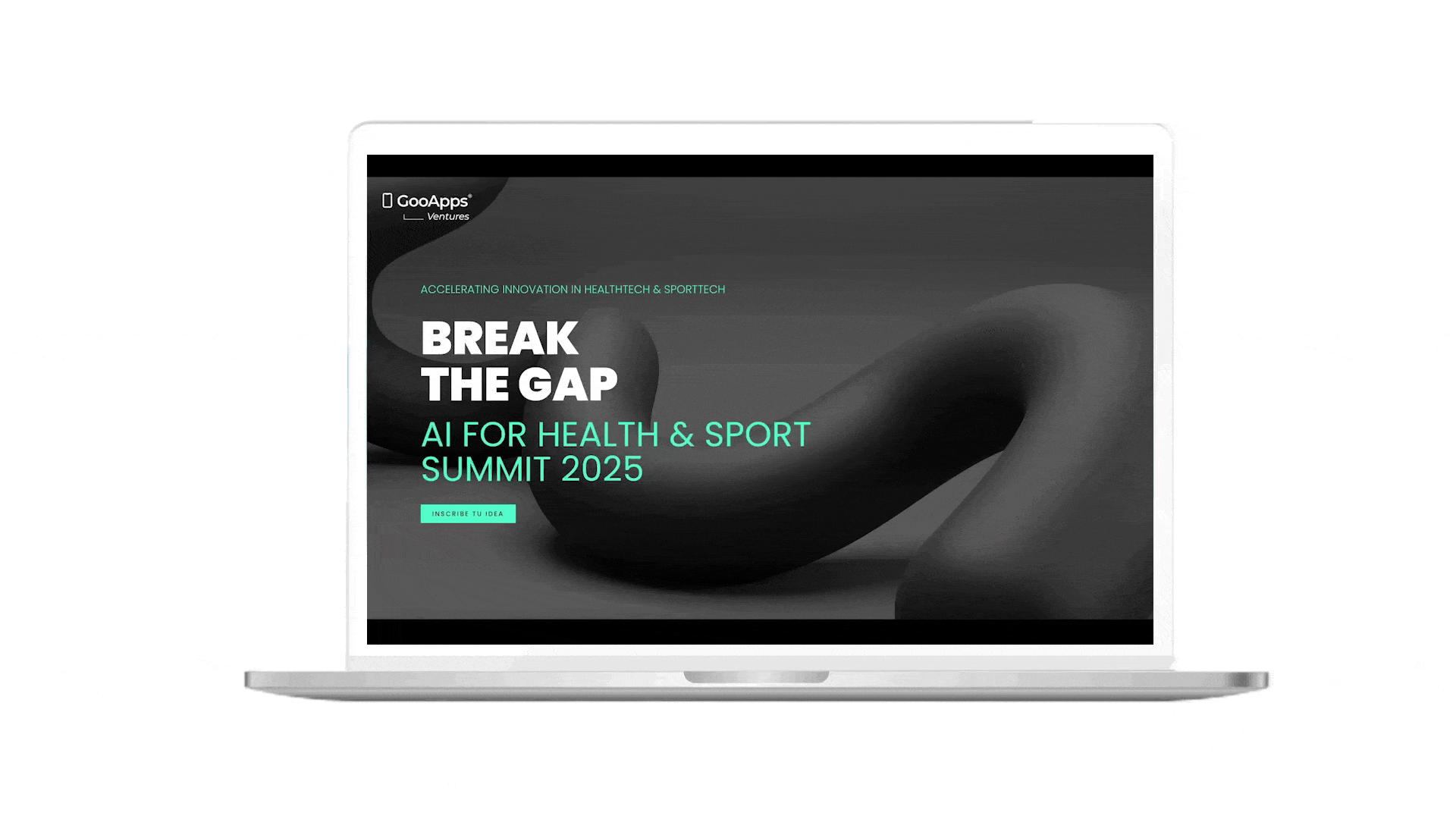
GooApps Ventures is an initiative designed to attract innovative startups in the health and sports sectors. The landing page was created to promote their upcoming event, where selected startups can receive funding and support to develop their digital products. The main goal of the site was to inspire trust, spark interest, and encourage applications from early-stage companies with promising ideas.
My Role
As the UI Designer, my responsibility was to take the existing brand foundation and elevate it into a visually impactful and engaging web experience. While the general design line was already defined, I focused on refining the interface to make it more dynamic, minimal, and high-tech—fitting both the innovation-driven theme and the startup audience.
Design Approach
The landing was designed with a clear focus on visual hierarchy and contrast, using bold typography, structured layouts, and striking color combinations to guide users through the page. I aimed to create a design that felt both elegant and futuristic, with enough personality to stand out while maintaining a sense of trust and professionalism.
Clean spacing and interactive elements helped bring the UI to life without overwhelming the user. The final result is a bold and minimal digital presence that aligns with the tech-forward positioning of GooApps Ventures.
What I Delivered
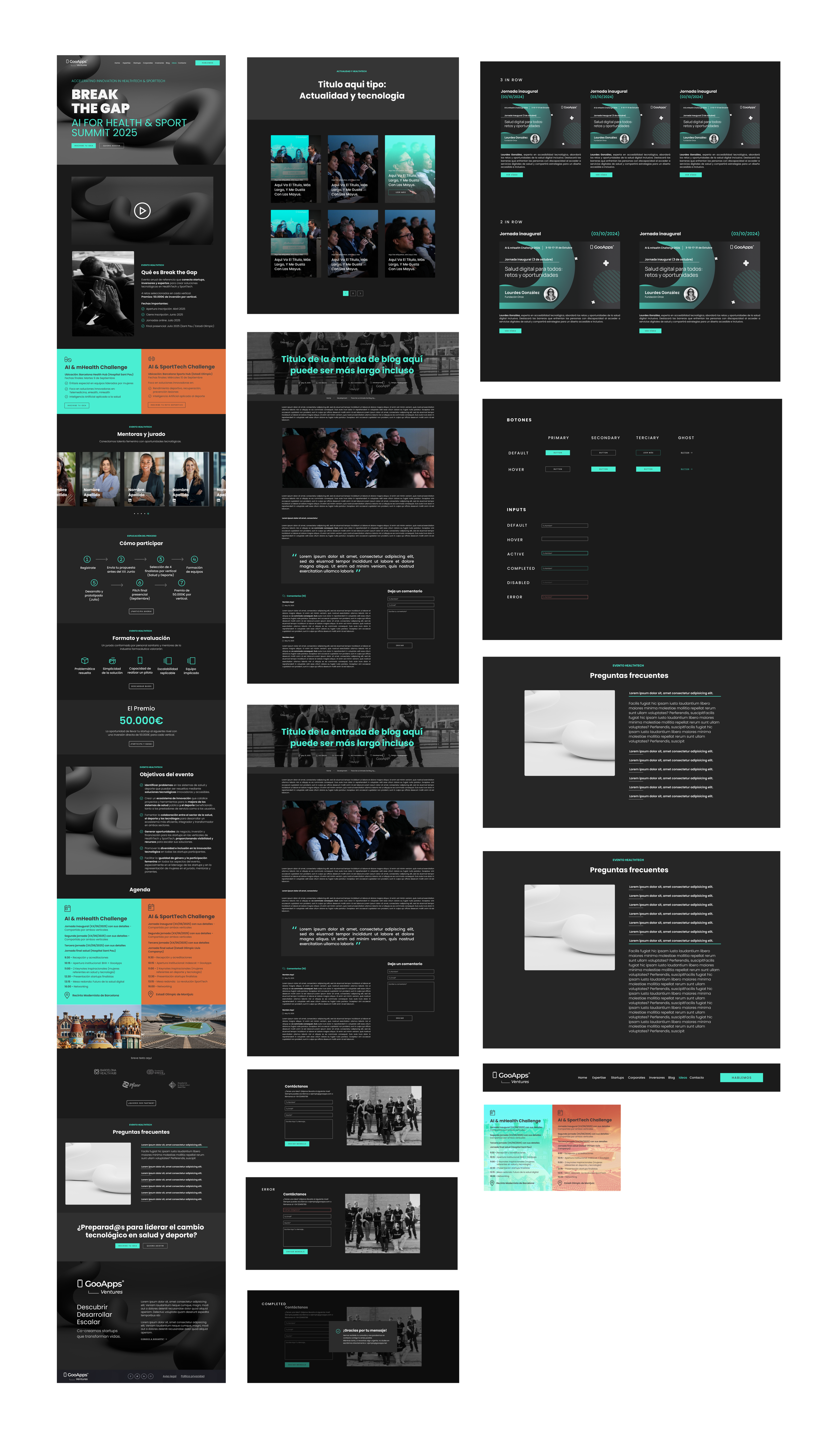
High-fidelity UI screens
Visual refinements and layout adaptations
Component design consistent with the existing brand system
Optimized sections for conversion and readability
What I Learned
This project was a great opportunity to build on an existing design system while pushing it to the next level. I focused on enhancing visual appeal without compromising clarity, resulting in a web experience that is both aesthetic and functional. It also taught me the value of subtle details—how small adjustments in spacing, color, or movement can have a strong impact on how a brand is perceived.