

Mi Gasolinera

Mobile CRM Overhaul for Gas Station Operators

There was a critical business need to equip gas station owners with an efficient, real-time management tool. While 4GL had a powerful software solution, the existing application was outdated and completely unusable on mobile viewports.
As the lead UX/UI designer within the GooApps team, my mission was to execute a comprehensive digital transformation. I managed the entire product lifecycle—from restructuring the information architecture and mapping optimized user flows to crafting the final high-fidelity interface, responsive prototypes, and core interaction design.
Senior UX/UI Designer
Role
Team
GooApps
Clients
4GL
Time
5 weeks

Original web app - Before redesign

Problems
The legacy application generated high user friction. On mobile devices, users were forced to constantly pinch-to-zoom just to read basic text blocks, making data consumption nearly impossible. The navigation was highly counterintuitive, the visual system was severely outdated, and modifying any data on a smartphone was a non-viable task. As a result, users abandoned the mobile view entirely, reverting strictly to desktop access out of sheer frustration.
Key Insights
Leveraging a large, active user base made it highly efficient to isolate exact behavioral pain points. After synthesizing quantitative user data and auditing successful industry benchmarks for mobile SaaS adaptations, I synthesized the key metrics that defined our MVP strategy:
80% Drop-off Rate: The vast majority of users abandoned the MiGasolinera platform when attempting to search for records or edit data entries.
90% Navigation Friction: Users experienced severe frustration with the core layout; accessing global menus or interacting with tap targets was highly inaccurate.
75% Low Visual Trust: Most operators found the dense interface visually unappealing and poorly structured to surface critical business metrics effectively.
Goal
Collaborating through strategic brainstorming sessions with the 4GL stakeholders and the GooApps engineering team, we established a clear product objective: engineer a highly responsive mobile-first manager. The new app must surface readable analytics, provide intuitive navigation patterns, and elevate the overall brand aesthetic.
Solutions
01.
Structural re-engineering to deploy an intuitive, accessible, and fluid mobile navigation system.
02.
Complete visual rebranding to deliver a modern, attractive, and mobile-friendly interface.
03.
A rigorous component redesign across all views to maximize usability and optimize text legibility under field-work conditions.
Design Solutions
01. Navigable and Intuitive
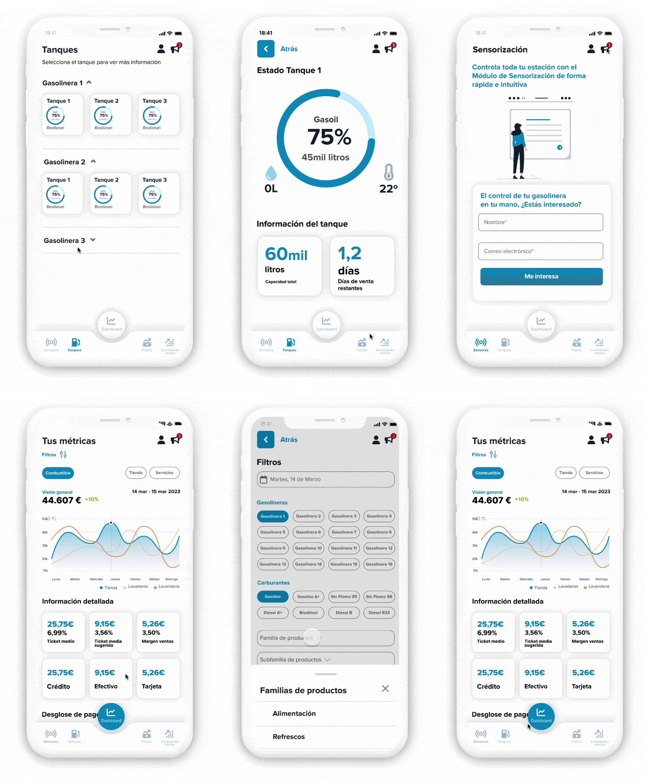
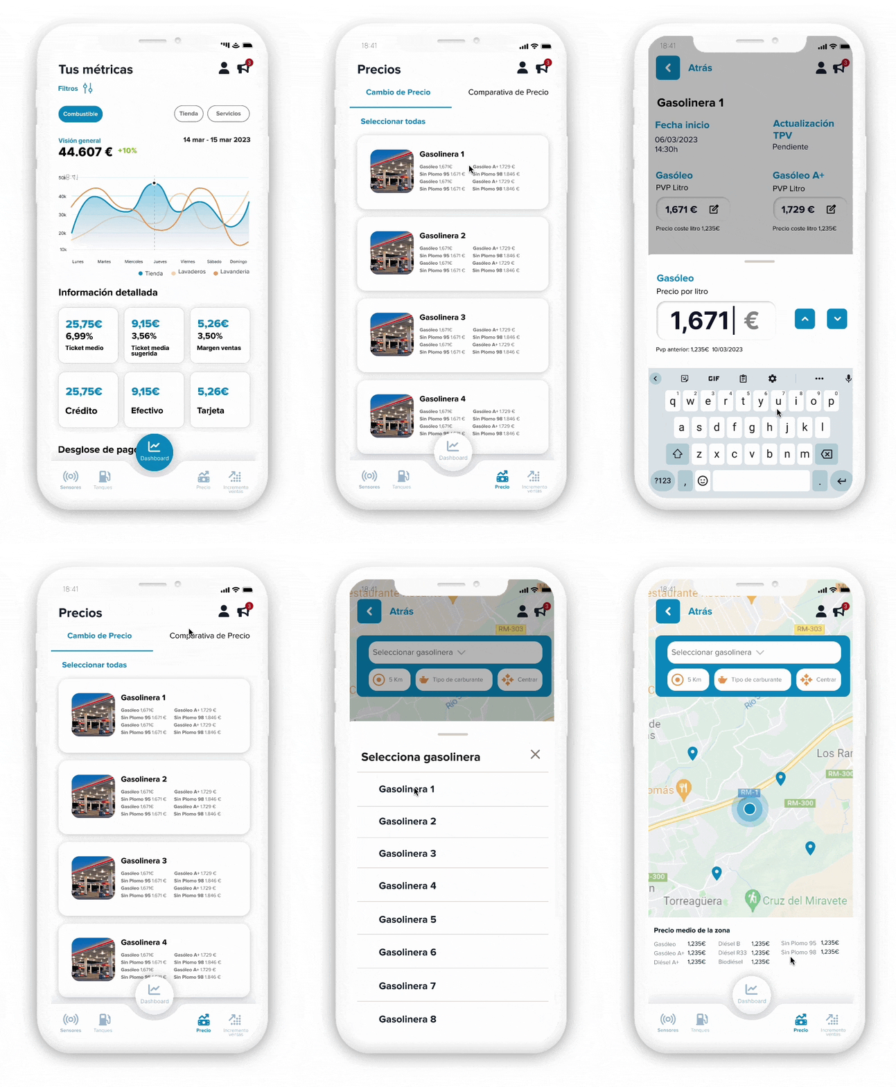
We established an agile, persistent bottom tab bar and clear information compartmentalization. This structural update gives operators immediate access to primary features, allowing them to jump between metrics and station controls with single-tap efficiency.

02. Mobile-friendly Design
By applying a strict user-centered methodology backed by empirical user research, the visual interface was elevated into a sleek, high-tech aesthetic. The data density was re-balanced specifically for mobile viewports, significantly improving cognitive processing and driving higher platform satisfaction.
03. Usable and Accessible
We systematically redesigned all form fields, input mechanics, and interactive buttons. By expanding touch targets to a minimum of 48px–56px and streamlining data-entry workflows, we successfully eliminated mobile input errors, completely removing the user's dependency on a desktop computer.
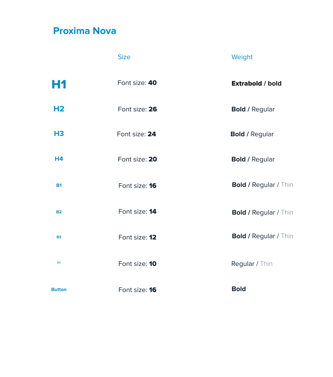
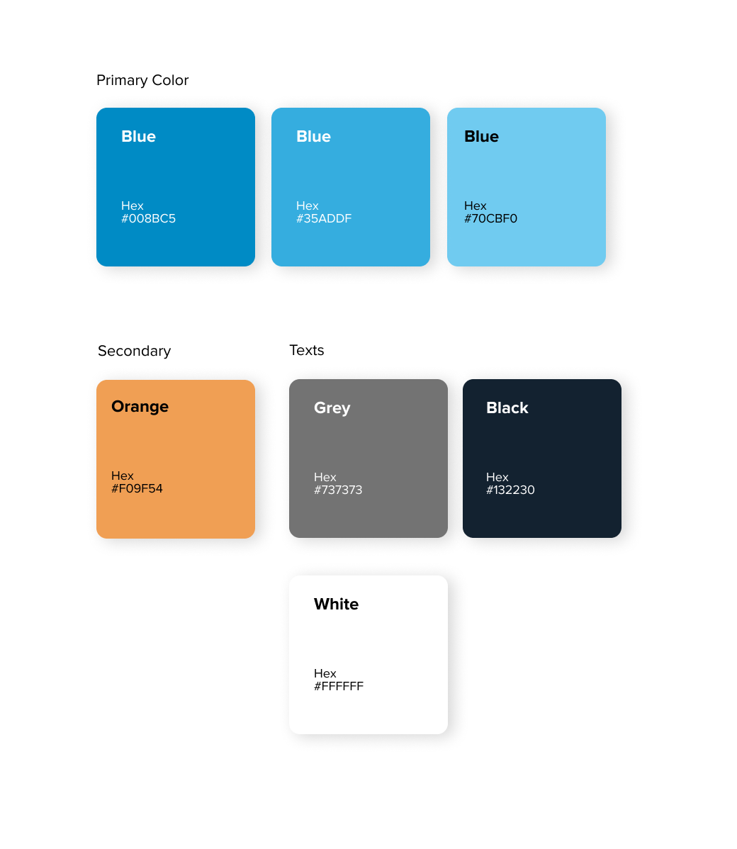
Style guide

Final UI - Tanques

Final UI - Incremento ventas

Final UI - Dashboard
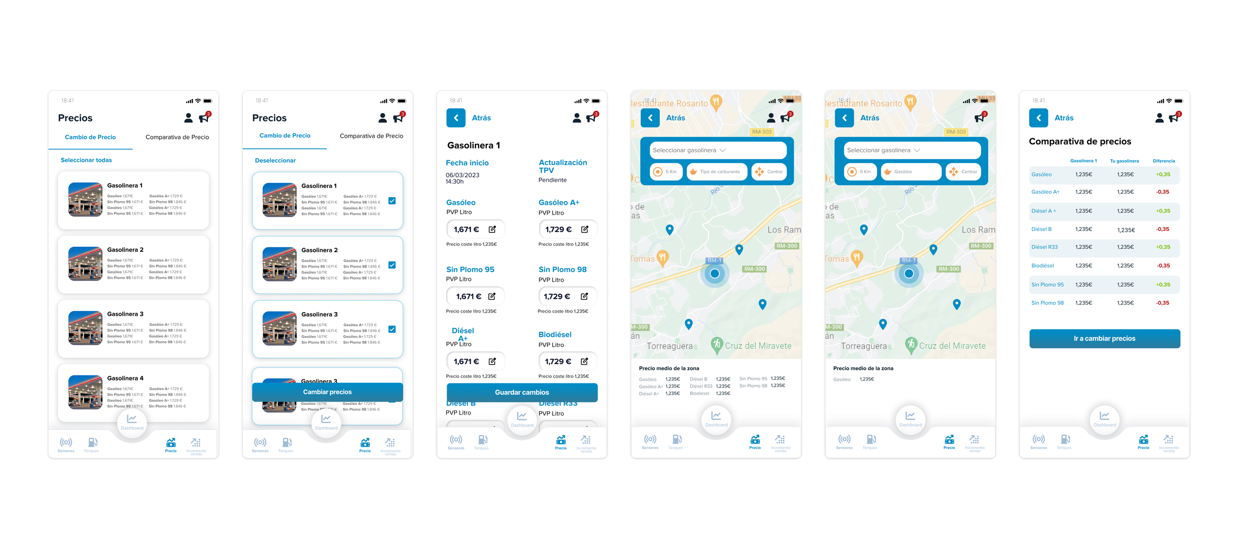
Final UI - Precios