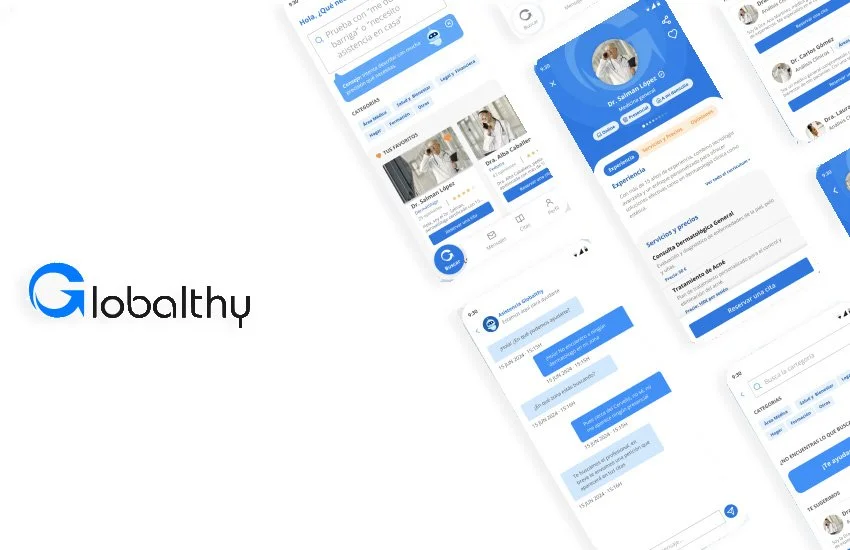
Globalthy

UX UI APP REDESIGN

Globalthy is a digital platform that allows users to find and book services—currently focused on healthcare professionals—with plans to scale across all service categories. The app provides an integrated experience where users can manage appointments, communicate with professionals, and explore service providers’ public profiles.
I worked on this project as both UX and UI Designer, taking part in every stage of the design process—from early research to final prototyping.
Team
Role
Clients
Time
UI Design
UX Design
GooApps
Globalthy
Prototyping
5 weeks
Rebranding
IxD Design
My Role
As the sole UX/UI Designer, I was responsible for:
Understanding the business needs and helping define the MVP
Designing low-fidelity wireframes to shape initial user flows
Developing high-fidelity mockups and aligning them with stakeholders
Designing the final UI and creating a fully interactive prototype
Delivering a clear information architecture and visual direction (moodboard)
Challenges
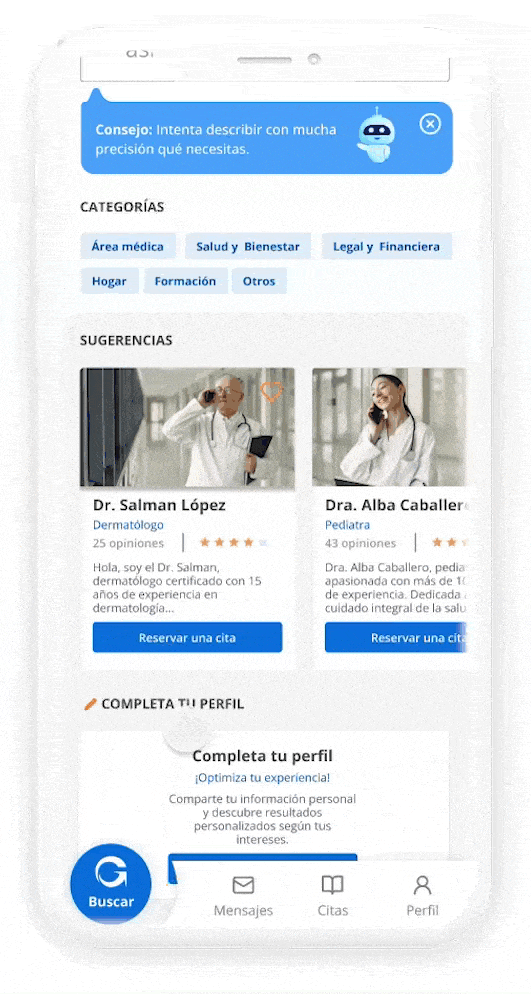
One of the key challenges was avoiding feature overload. To keep the experience simple and intuitive, we carefully selected only the core functionalities for the MVP. Another challenge was integrating a smart search tool connected to AI, allowing users to quickly find the services they need through conversational input with the question: “What do you need?”
UX Approach
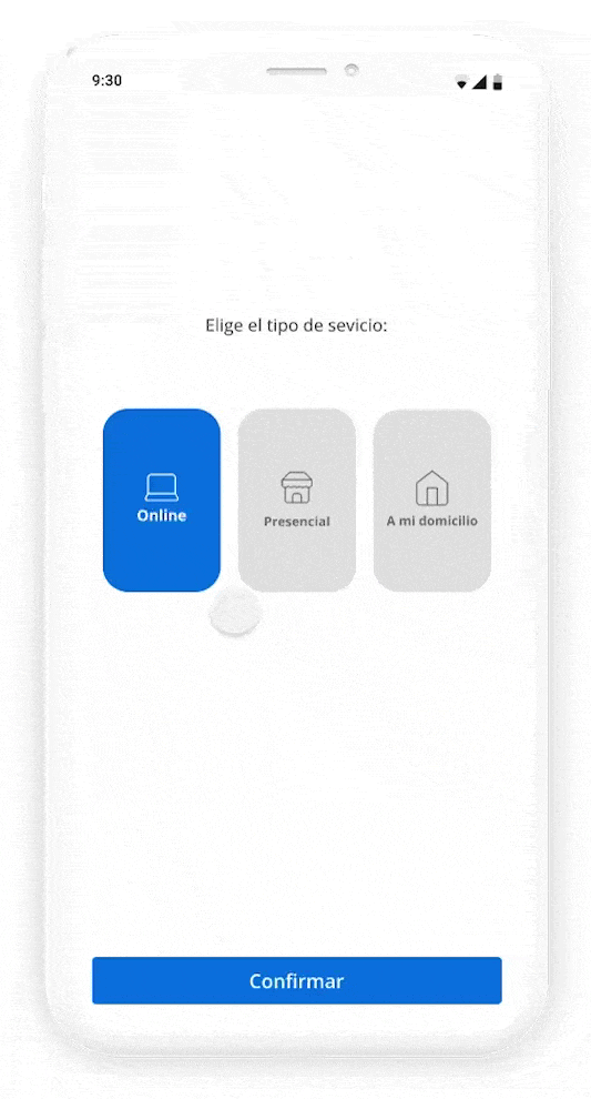
We focused on minimizing user effort and friction. I applied a one-action-per-screen approach to make the navigation feel lighter and more user-friendly—similar to an onboarding experience. From service discovery to booking, the UX flow was built to guide users through the process in the simplest way possible.
Design Solutions
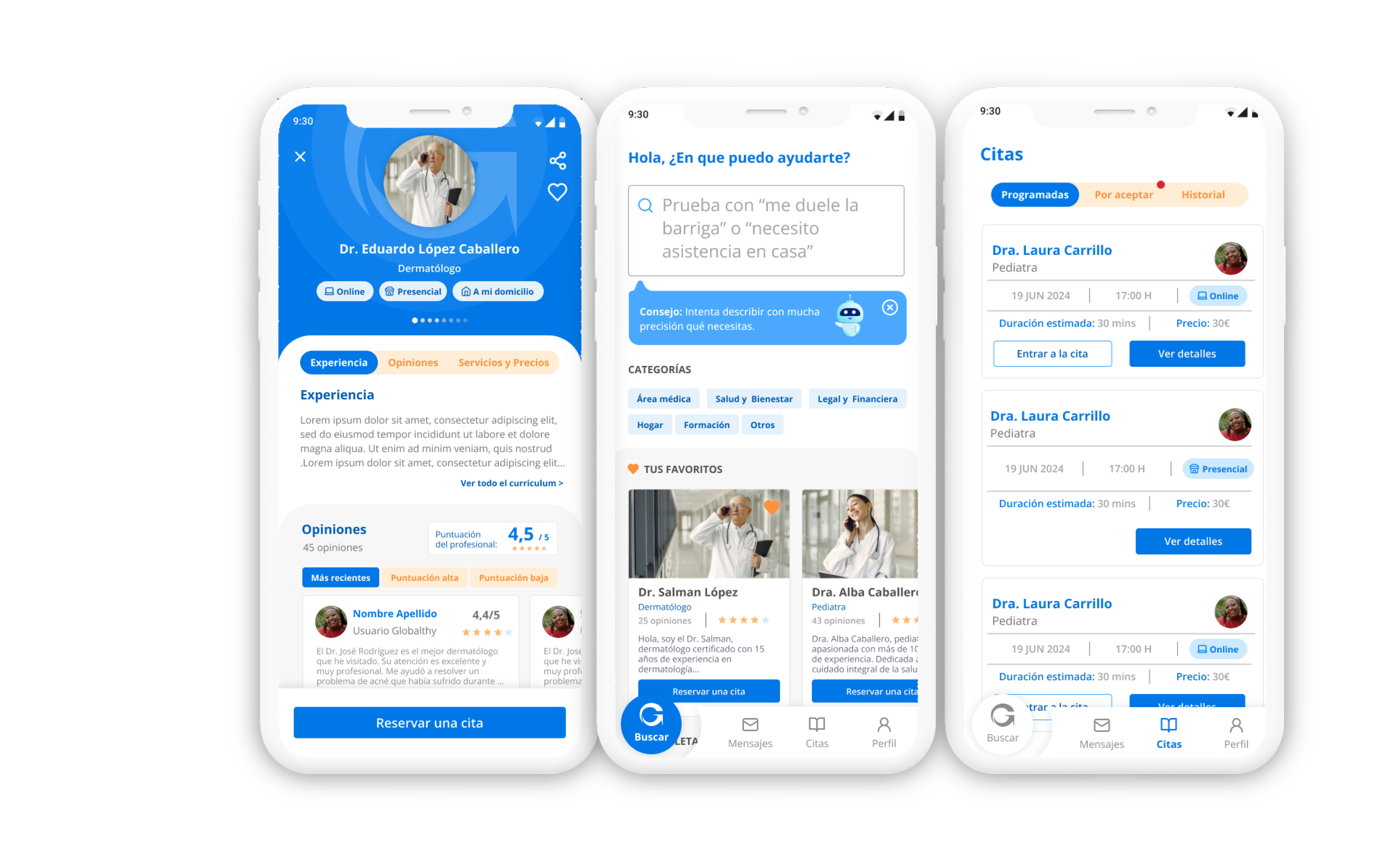
01. Smart and Efficient Search Experience
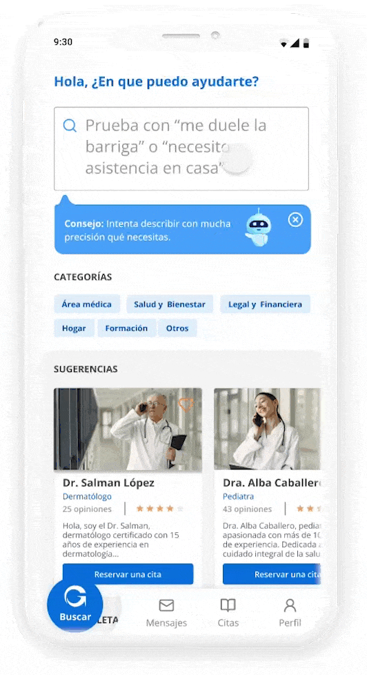
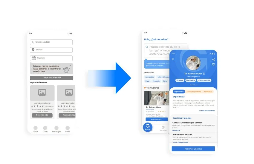
One of the most powerful features in Globalthy is the intelligent search engine, designed to help users find exactly what they need with minimal effort. By integrating AI-based suggestions and conversational-style prompts, the search becomes more dynamic and human. Instead of endless filtering, users can simply type or select what they’re looking for and get relevant service providers instantly. The design is clean, quick to access, and central to the app’s value—making discovery not just fast, but also enjoyable.
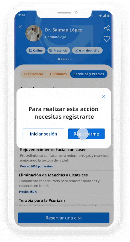
02. Simple Yet Effective Registration Flow
The sign-up process was carefully crafted to be as lightweight as possible, while still collecting essential information. Each screen was designed to handle just one action, reducing cognitive load and making the process feel smooth and quick. Whether creating a user or professional account, the flow adapts to the user type while keeping the same clear and minimal interface. The result: a frictionless experience that gets users onboarded fast, without skipping important details.
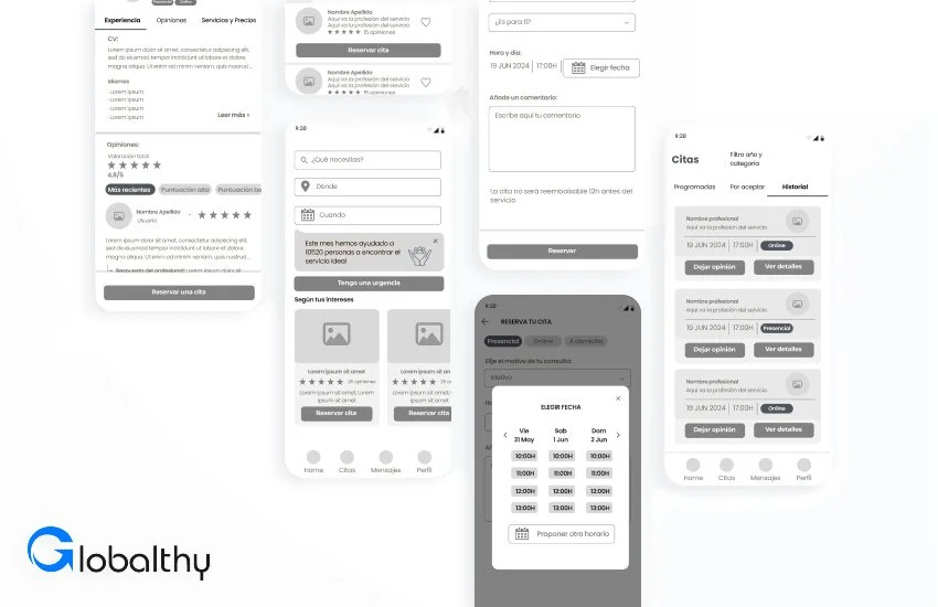
Scheduling an appointment on Globalthy is a seamless, guided experience. After selecting a service provider, users can instantly check availability, choose a time slot, and confirm the appointment in just a few taps. Micro-interactions and clear visual hierarchy help users stay oriented, while the flow prioritizes clarity and speed. The booking system feels personal, not transactional—turning a routine task into something intuitive and even pleasant.
03. Booking Appointments Made Intuitive
04. Appointment Management Made Easy
Managing appointments is just as simple as booking them. Users can view upcoming visits, accept changes, or cancel with one tap. Notifications and reminders keep everything on track, and the interface clearly separates confirmed, pending, and past appointments. This functionality was designed to reduce user anxiety and increase control, empowering users to handle their schedules with confidence and ease.
UI Kit & Visual Rebranding
When I joined the project, Globalthy only had a basic logo—no visual guidelines or established identity. I saw this as an opportunity to build a fresh and cohesive design system that could grow with the product.
I started by defining a modern, approachable look and feel: clean typography, soft colors, rounded elements, and intuitive iconography. The goal was to create a visual language that felt both current and comforting, especially given the app’s initial focus on healthcare.
The UI kit included components, spacing rules, color system, icon sets, and states for interaction. This not only ensured consistency across the product, but also helped developers work more efficiently. The result is a friendly, professional interface that reflects the brand’s values and enhances user trust.

What I Learned
This project reinforced the importance of designing with clarity and intention. By reducing distractions and focusing on what users truly need at each step, the experience became more fluid and meaningful. I also deepened my ability to balance client requirements with user-centered thinking—especially when defining the scope of an MVP.
Conclusion
Designing Globalthy was an opportunity to create a meaningful, user-first product that balances simplicity with powerful functionality. By focusing on intuitive navigation, clear visual language, and smart feature prioritization, the final experience empowers users to find, book, and manage services with ease.
This project also deepened my ability to translate complex needs into clean, actionable interfaces, while collaborating closely with stakeholders to align business goals with UX principles. I’m proud of the result and excited to see how Globalthy continues to grow beyond the healthcare space into a broader service ecosystem.