Globalthy

Mobile App Redesign (B2C / B2B)

Globalthy is a digital ecosystem designed to streamline service discovery and booking. While initially launching in the healthcare sector, the platform’s business core was engineered to scale seamlessly into any service industry.
As the Lead UX/UI Designer within the GooApps team, my challenge was to transform a basic concept into a robust MVP, establishing a highly scalable design language and an inclusive user experience from day one.
Lead UX/UI & Design System Specialist
Role
Team
Clients
GooApps
Globalthy
Timeline
5 weeks
Feature Overload vs. MVP Scope: Balancing ambitious stakeholder feature requests with a clean, lightweight, and user-centric initial launch.
AI Conversational Integration: Crafting an intuitive, non-intimidating visual wrapper for a smart, AI-driven search engine centered around a single natural language input: "What do you need?"
Zero Architectural Base: Building the interface with no prior visual guidelines, requiring a simultaneous brand overhaul and design system implementation.
The Product Challenges
UX Approach
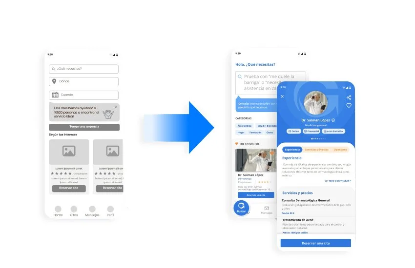
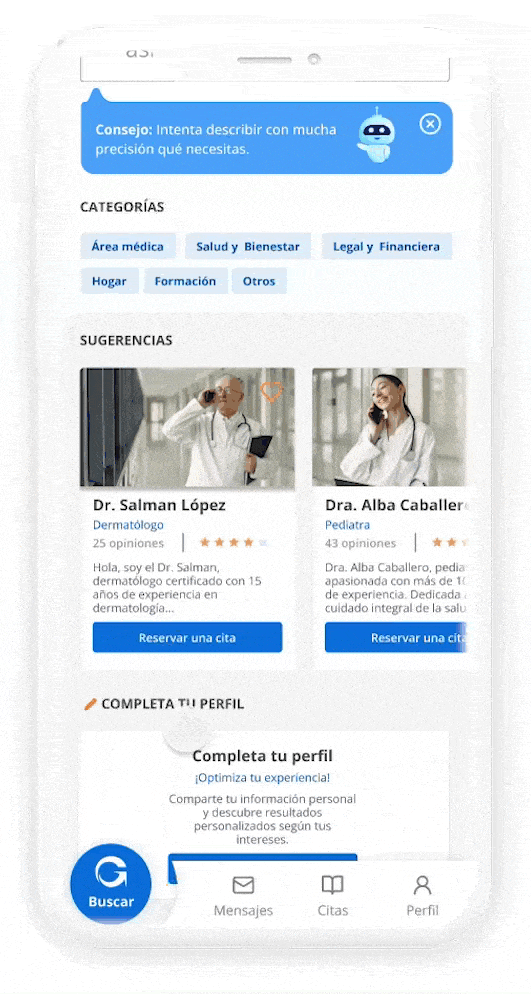
We focused on minimizing user effort and friction. I applied a one-action-per-screen approach to make the navigation feel lighter and more user-friendly—similar to an onboarding experience. From service discovery to booking, the UX flow was built to guide users through the process in the simplest way possible.
Strategic UI & Accessibility Solutions
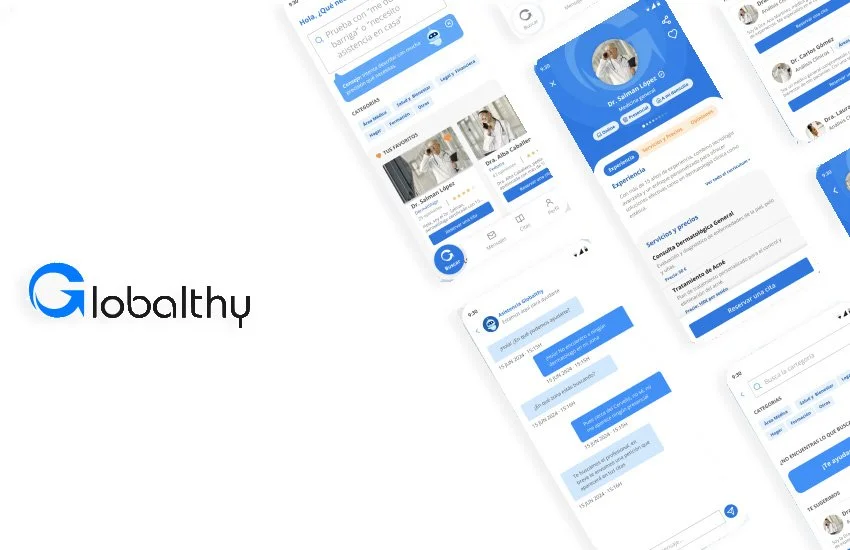
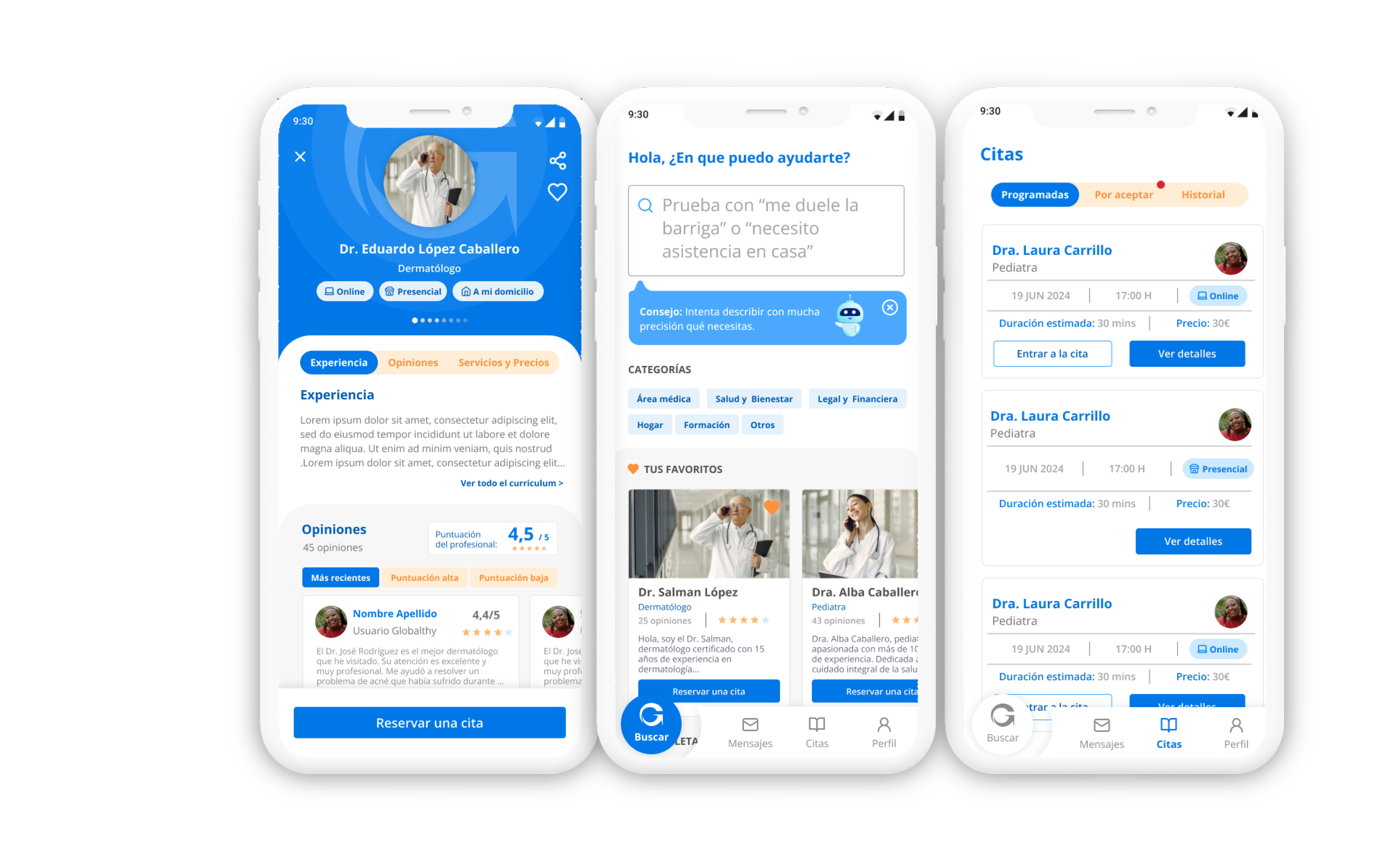
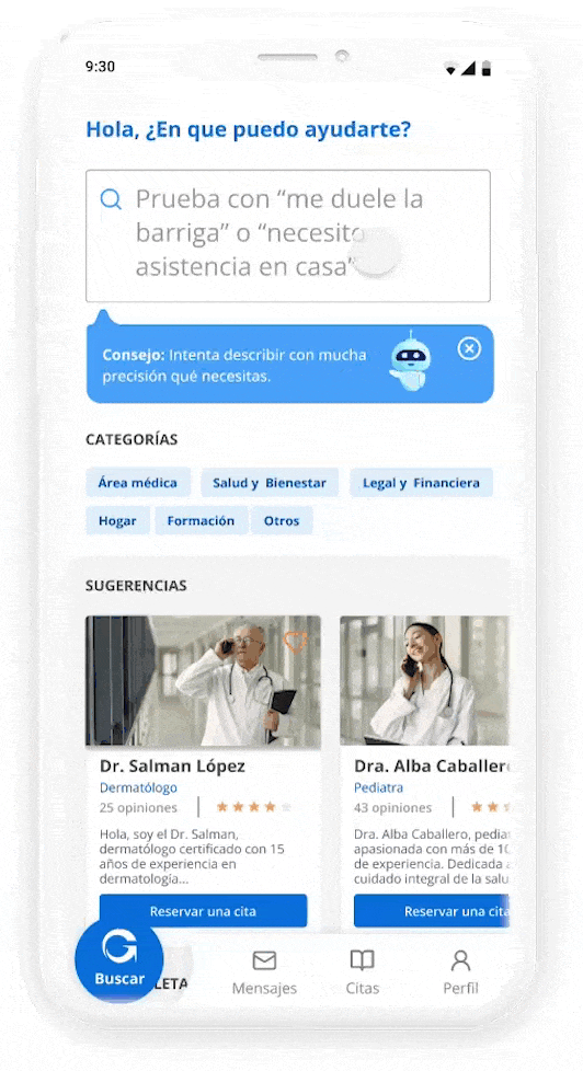
One of the most powerful features in Globalthy is the intelligent search engine, designed to help users find exactly what they need with minimal effort. By integrating AI-based suggestions and conversational-style prompts, the search becomes more dynamic and human. Instead of endless filtering, users can simply type or select what they’re looking for and get relevant service providers instantly. The design is clean, quick to access, and central to the app’s value—making discovery not just fast, but also enjoyable.
01. AI-Driven Conversational Search
02. Frictionless "One-Action-per-Screen" Onboarding
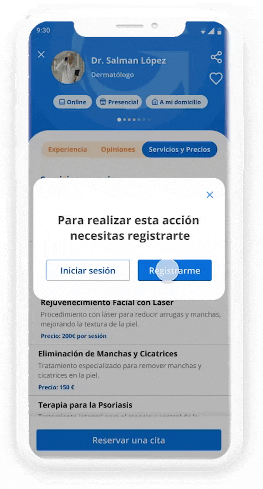
The registration process handles distinct user archetypes (patients and medical professionals) while maintaining a unified interface.
Accessibility Integration: I structured the onboarding flow around a One-Action-per-Screen paradigm. This layout minimizes cognitive friction and drastically optimizes keyboard navigation and Screen Reader (A11y) compatibility. Inputs utilize permanent, highly visible labels rather than relying on floating placeholders, preventing context loss and reducing errors.
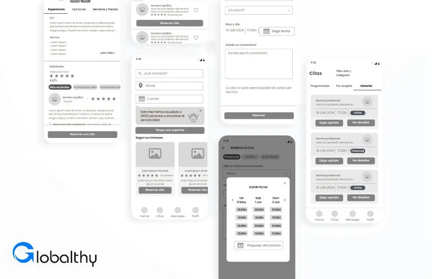
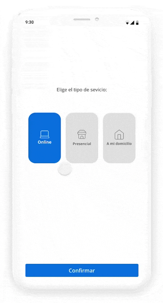
03 & 04. Intuitive Booking & Stress-Free Appointment Management
Booking a service can cause anxiety, especially in healthcare contexts. The interface transforms transactional friction into a reassuring visual flow.
Inclusive UI Design: Integrated purpose-driven micro-interactions, clear visual feedback, and smooth state transitions. For the scheduling dashboard, I implemented an accessible color-coding system paired with unique geometric shapes to distinguish between confirmed, pending, and past appointments. This guarantees that the system is fully functional for users with color vision deficiencies (CVD) without relying solely on color to convey critical status updates.

❖ The Core Pillar: From UI Kit to Scalable Design System
Joining a project with only a basic logo, I utilized my background in graphic design to build a comprehensive, production-ready design system from scratch.
[Design Tokens] ──► [Component Library] ──► [Accessible UI Views]
(Colors & Typography)    (Variants & Properties)       (WCAG AA Compliant)
The Core Pillar: From UI Kit to Scalable Design System
❖ Visual Foundations & Art Direction
Designed a comforting, trustworthy aesthetic tailored for healthcare but neutral enough for future market scaling.
Selected a soft color palette ensuring a minimum 4.5:1 contrast ratio (WCAG 2.2 AA compliance) across all text and interactive elements.
Curated a custom, geometric iconography set with consistent stroke weights and rounded corner radiuses (8px and 12px) to project friendliness and professional authority.
❖ System Architecture & Design Tokens
Established a rigid Design Token architecture in Figma to govern color primitives, spacing scales (built on a strict 4px/8px grid), and typography styles.
This tokenized foundation ensures that if the platform scales to a new sector (e.g., legal or beauty), a global "re-skinning" of the app can be executed in hours rather than weeks.
❖ Component Governance & Dev Handoff
Every interface asset (buttons, form inputs, feedback cards, bottom sheets) was built using Figma Auto Layout, Variants, and Component Properties.
All components natively embed their respective interactive states. This rigid structure eliminated guesswork for the GooApps engineering team, drastically reducing cross-team friction and accelerating handoff efficiency.
Strategic Takeaways
Accessibility as an Accelerator, Not a Blocker: This project proved that embedding WCAG principles from day one does not delay tight 5-week MVP timelines. Instead, designing with accessibility constraints protects the product from costly, late-stage design and code refactoring.
Systemic Thinking Wins: Investing time in establishing design tokens and component governance by week 2 allowed us to rapidly build out complex dashboard screens in the final weeks with 100% design consistency and seamless developer alignment.