Surfland

Mobile App Interface Rework

Surfland is a specialized digital platform dedicated to helping the surfing community discover prime surf spots, track beach conditions, and source equipment.
Collaborating with the GooApps team during an agile 2-week sprint, my objective was to overhaul specific high-friction interfaces. The goal was to improve data readability, enhance visual hierarchy, and streamline the overall user experience without losing the brand's adventurous core identity.
Senior UX/UI Designer
Role
Team
GooApps
Clients
Surfland
Timeline
2 weeks
High Cognitive Load: Vital surf and weather data were trapped in dense, unoptimized tables, hindering quick decision-making for surfers on the move.
Displaced Features: E-commerce elements were cluttering informational screens, diluting user intent and disrupting the interface's primary focus.
UI Inconsistencies: Suboptimal typographic hierarchies (such as forced all-caps text) and poor spacing rules were compromising scannability and professional polish.
The Core Challenges
Targeted UI & UX Solutions
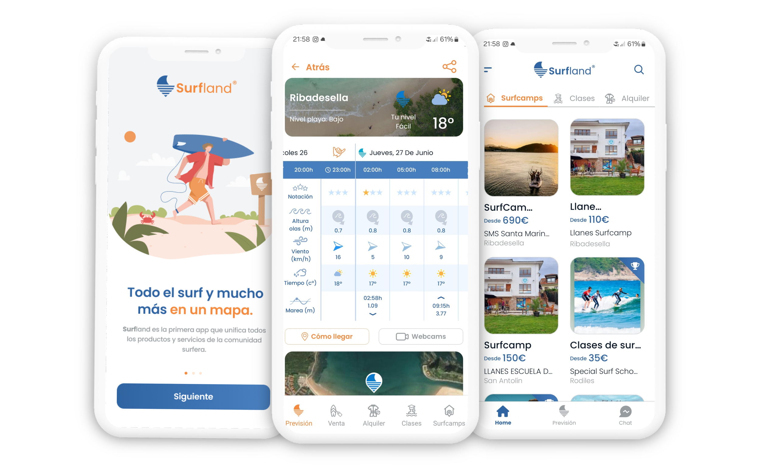
Screen redesign: Beach Weather Prevision
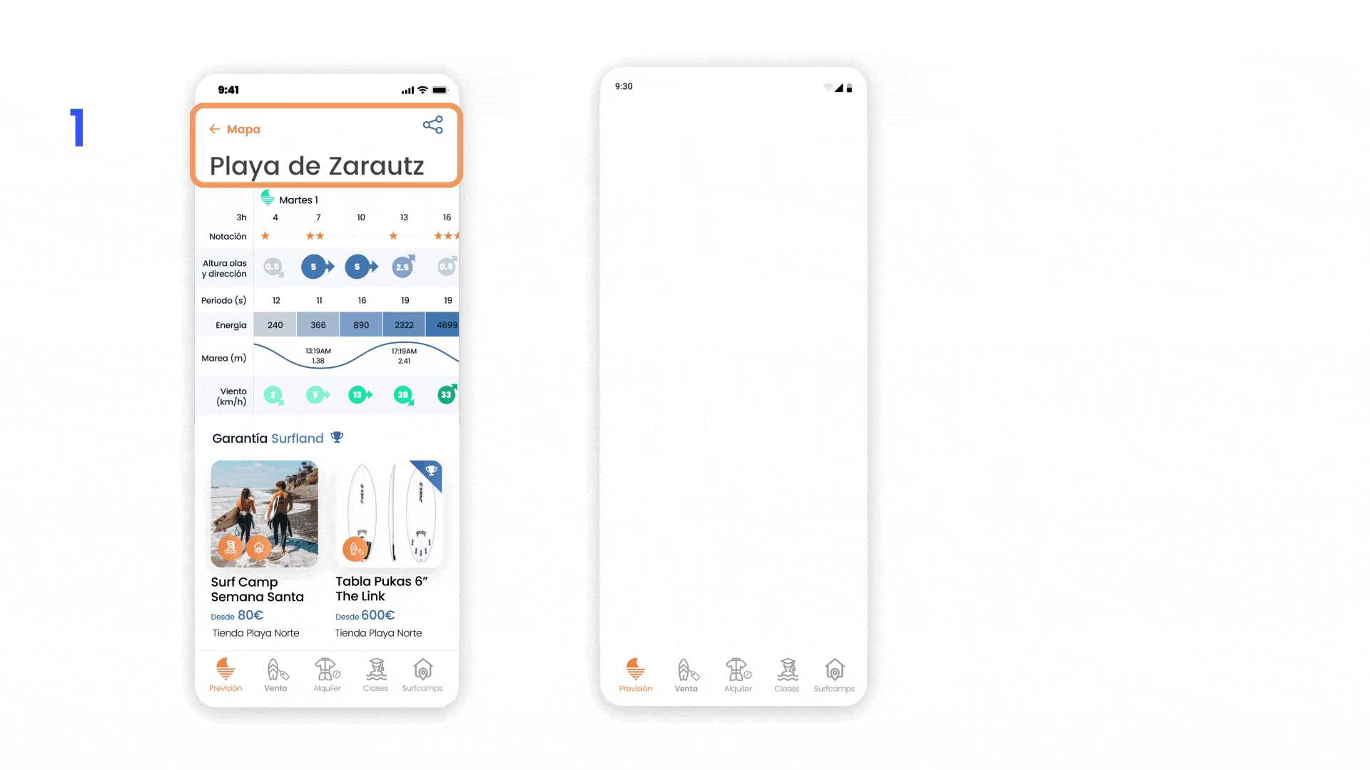
We engineered a refined header layout with a modern aesthetic, instantly surfacing real-time surf conditions and critical weather data at a glance.
1
We optimized the sea information matrix, staying strictly within Surfland’s core color palette. By introducing custom, high-metaphor iconography and restructuring the data layout, we transformed the table into a highly scannable, graphic-driven dashboard that prioritizes vital surf metrics.
2
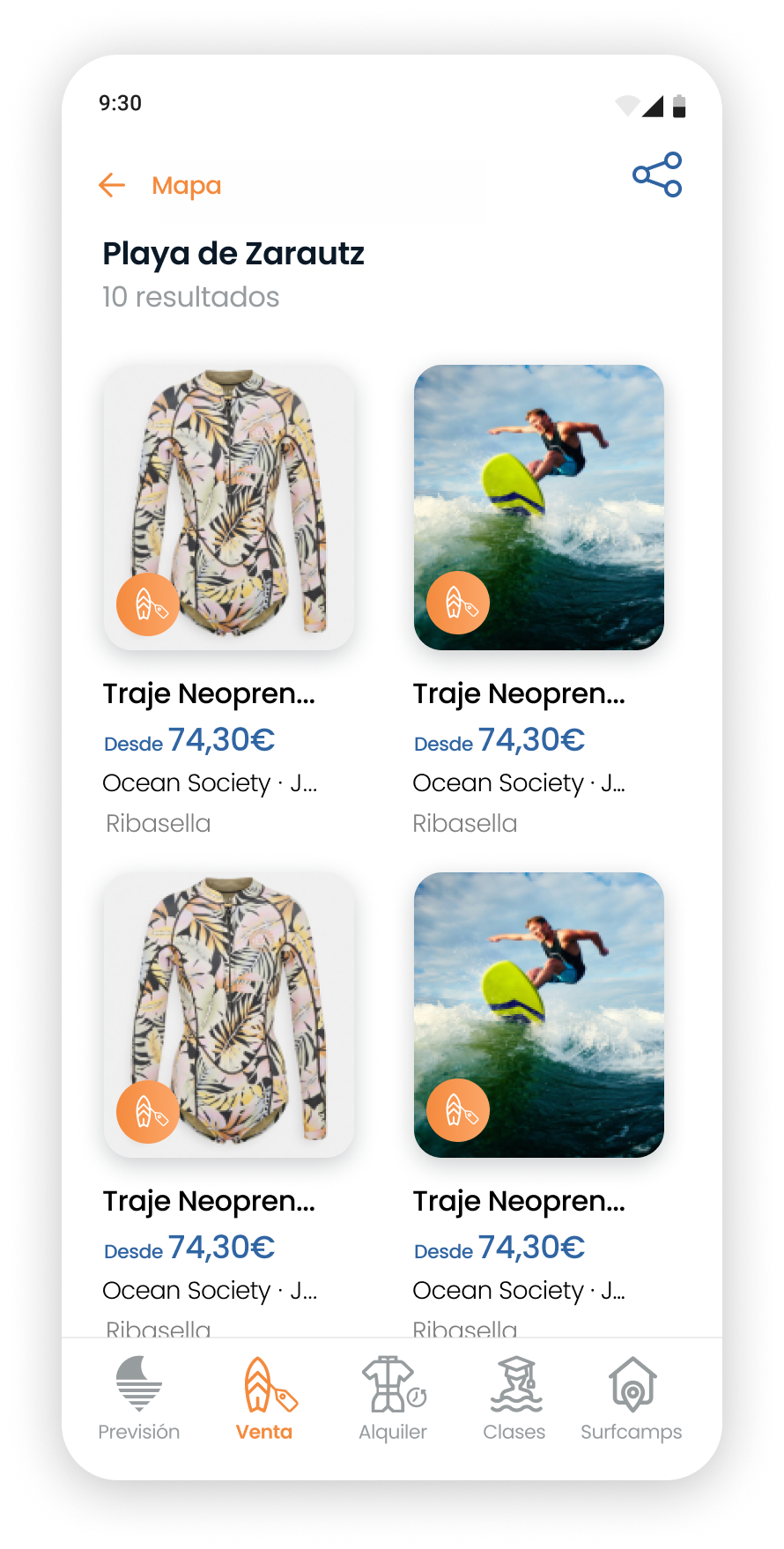
We enriched the contextual beach data while decluttering the core view. Removing the misplaced product listings allowed us to offload commercial noise to its dedicated section, completely aligning the screen with immediate user intent.
3
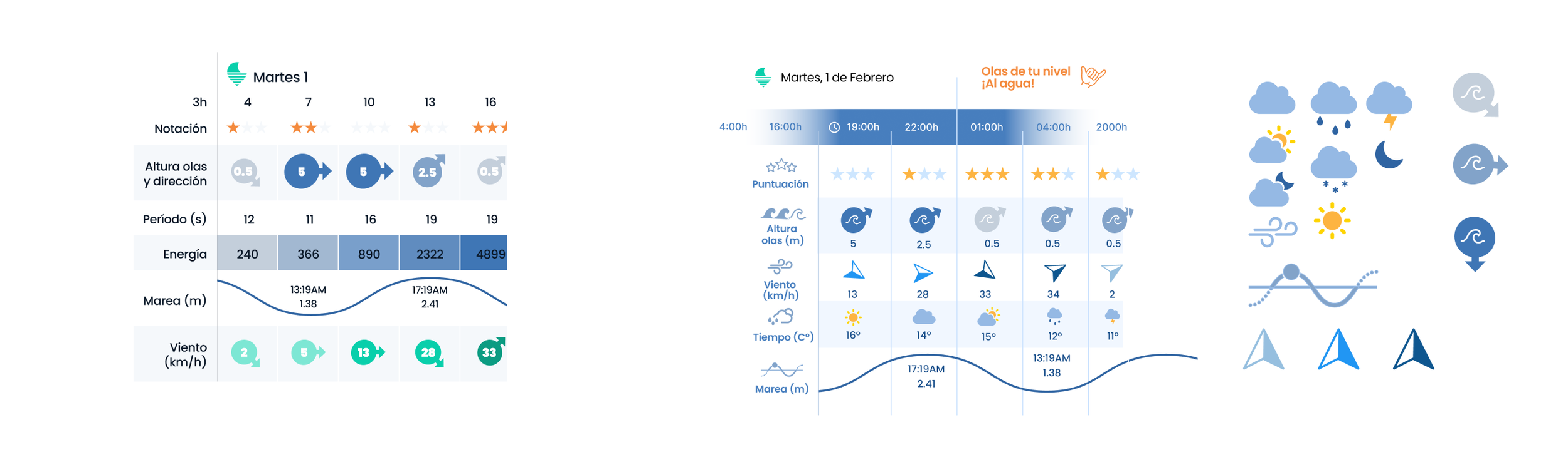
Old table
New table
Screen redesign: Store Items
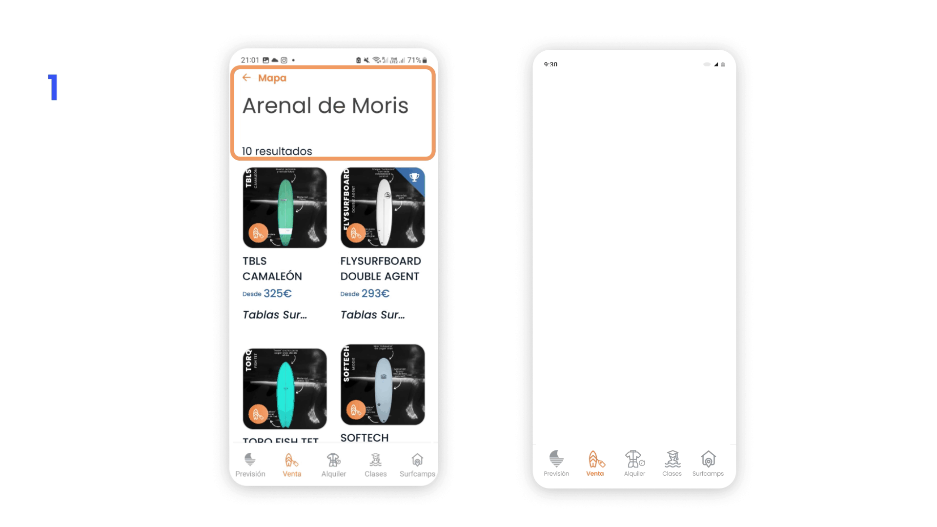
1
We optimized the screen header to be more compact while drastically enhancing typographic hierarchy. Minimizing vertical padding maximized viewport real estate, creating a larger visual area to showcase product imagery higher up on the screen.
2
We completely redesigned the product cards to elevate overall readability. By eliminating forced all-caps styling in the titles, we improved text wrapping and scannability. Additionally, we integrated key localized data—such as shop name and proximity—and applied a balanced spacing system to enhance visual hierarchy and layout breathing room.

Old card
New card
Final UI