

ToReimc

Medical Gamification & Community Platform

ToReimc is an educational trivia-based platform designed for medical graduates and practicing doctors to review complex, highly technical medical concepts. The platform successfully transformed rigorous academic study into a cheerful, fiercely competitive ecosystem, rapidly capturing over 500 active users within its first few months.
Collaborating with the GooApps team during a 4-week sprint, my responsibility was to design the end-to-end product experience. The primary challenge was striking the perfect balance between the precision of medical data and a humorous, highly engaging tone, while embedding behavioral mechanics to drive daily active retention.
Senior UX/UI Designer
Role
Team
GooApps
Clients
ToReimc
Timeline
4 weeks
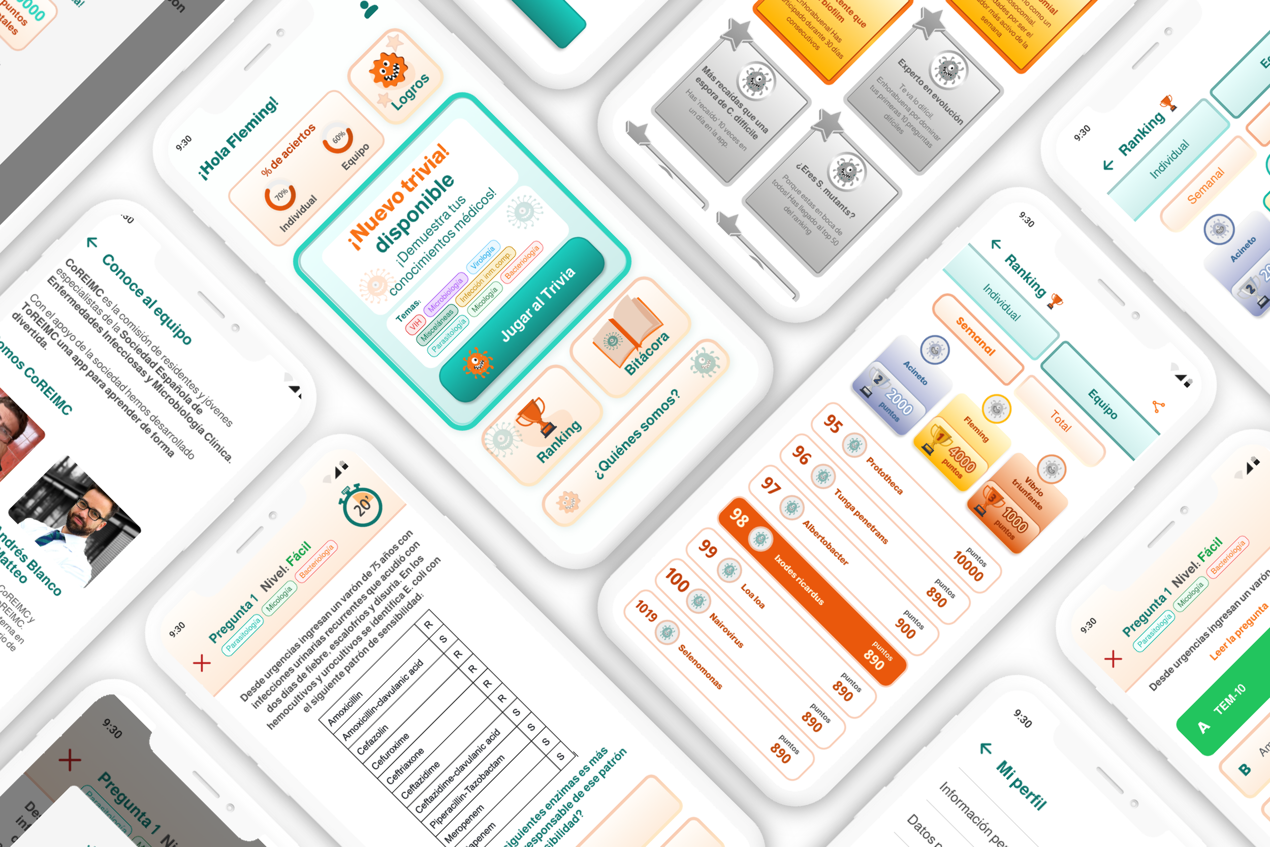
The Product Challenges
Tone of Voice vs. Subject Matter: Bridging the gap between rigid, high-stakes medical terminology and a witty, casual gamified ecosystem.
Engagement Loop Engineering: Building long-term retention mechanics (rankings, milestones, trophies) that keep busy medical professionals coming back to compete.
MVP Scope Constraints: Identifying high-impact core features for immediate deployment while strategically deferring complex features to later phases.
Strategic UI & UX Solutions
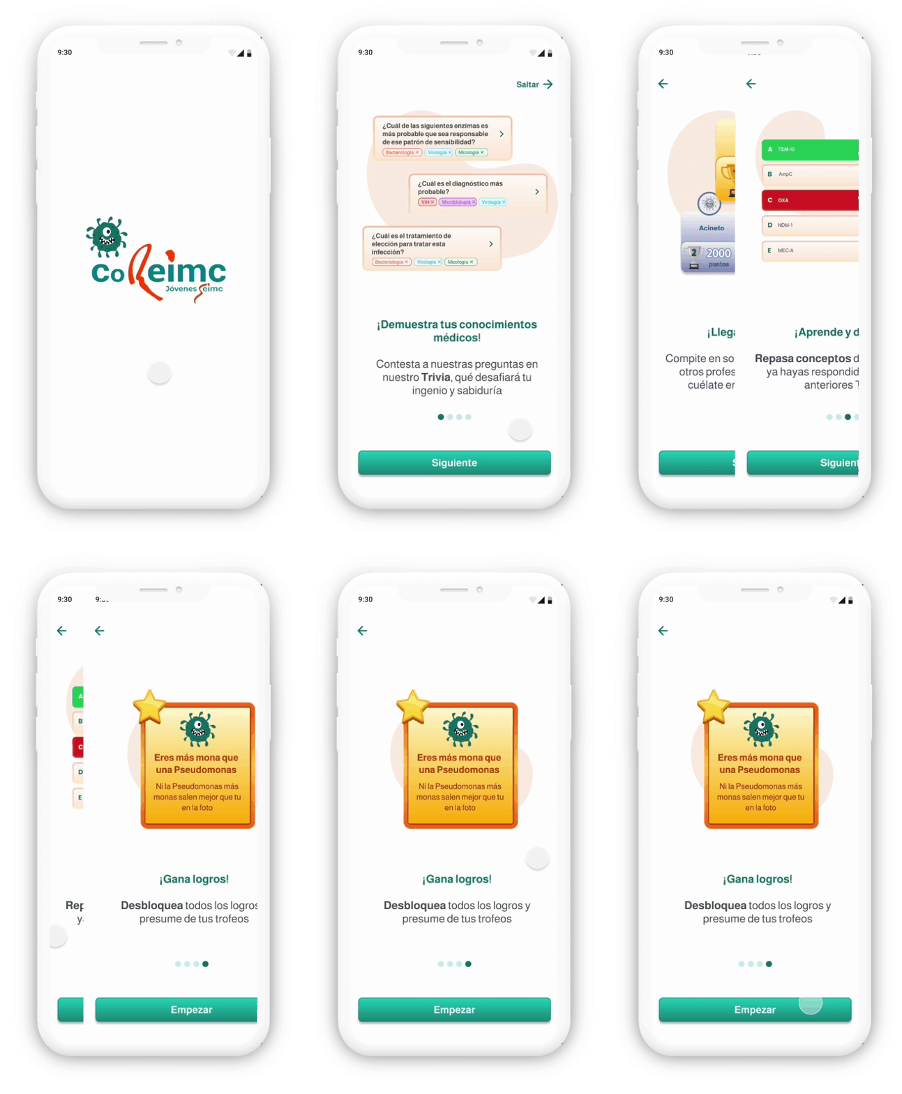
01. Frictionless Brand Onboarding
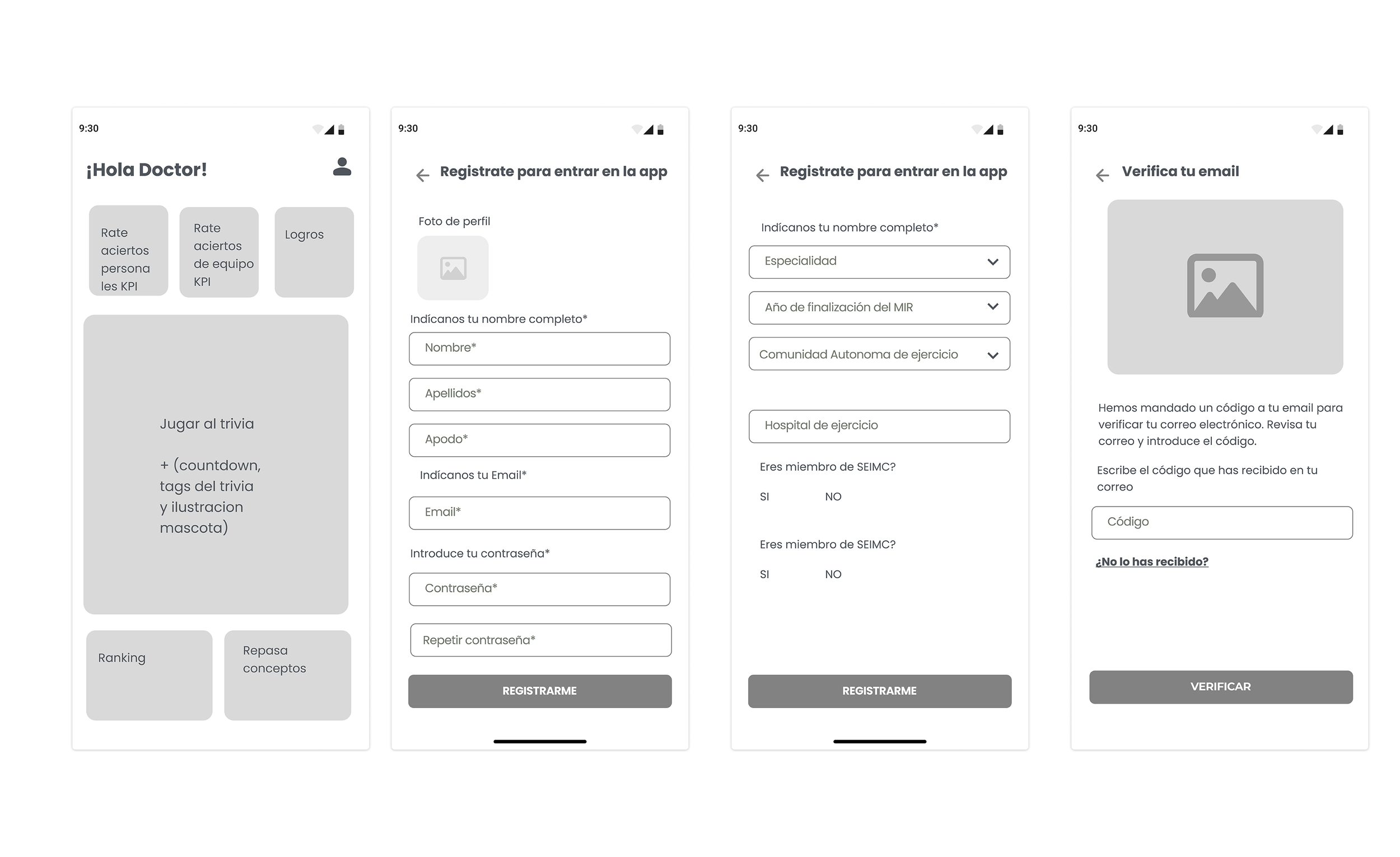
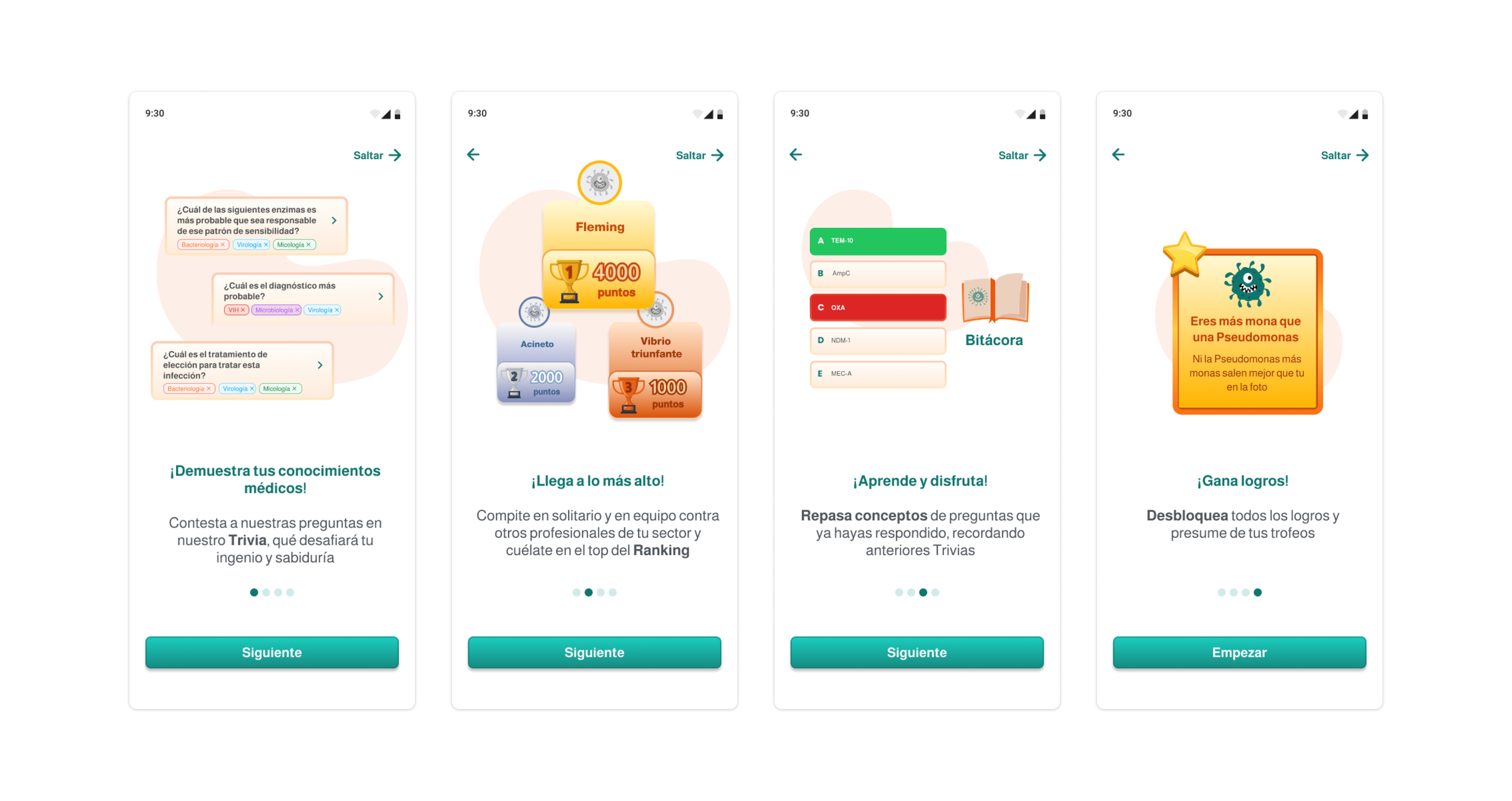
The Approach: Engineered an accelerated, high-conversion onboarding flow that summarizes the core mechanics of the app while immediately immersing the user in the product's unique visual mood. By keeping it brief, we minimized drop-off rates while establishing the platform's cheerful identity from screen one.
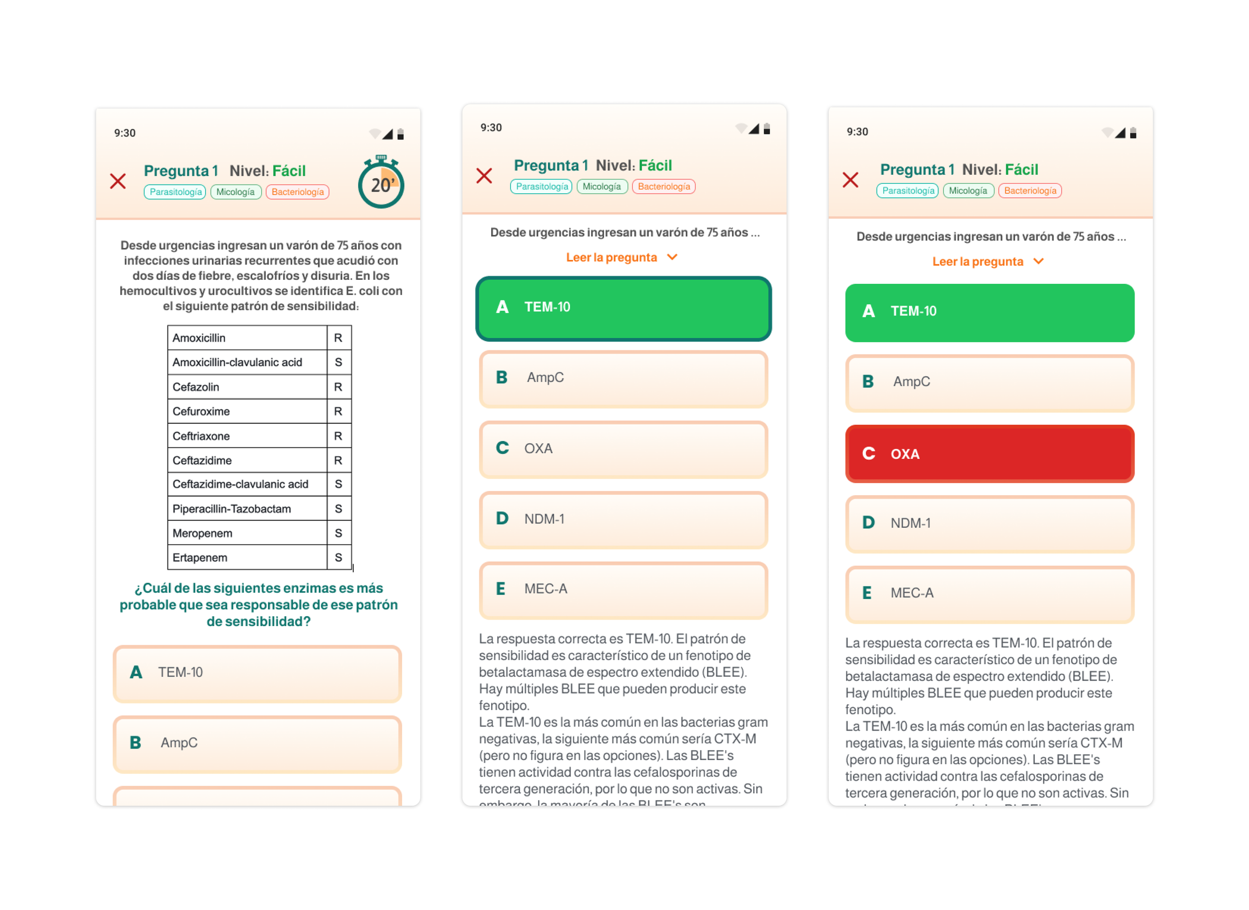
02. Dynamic Trivia Core & Feedback Loops
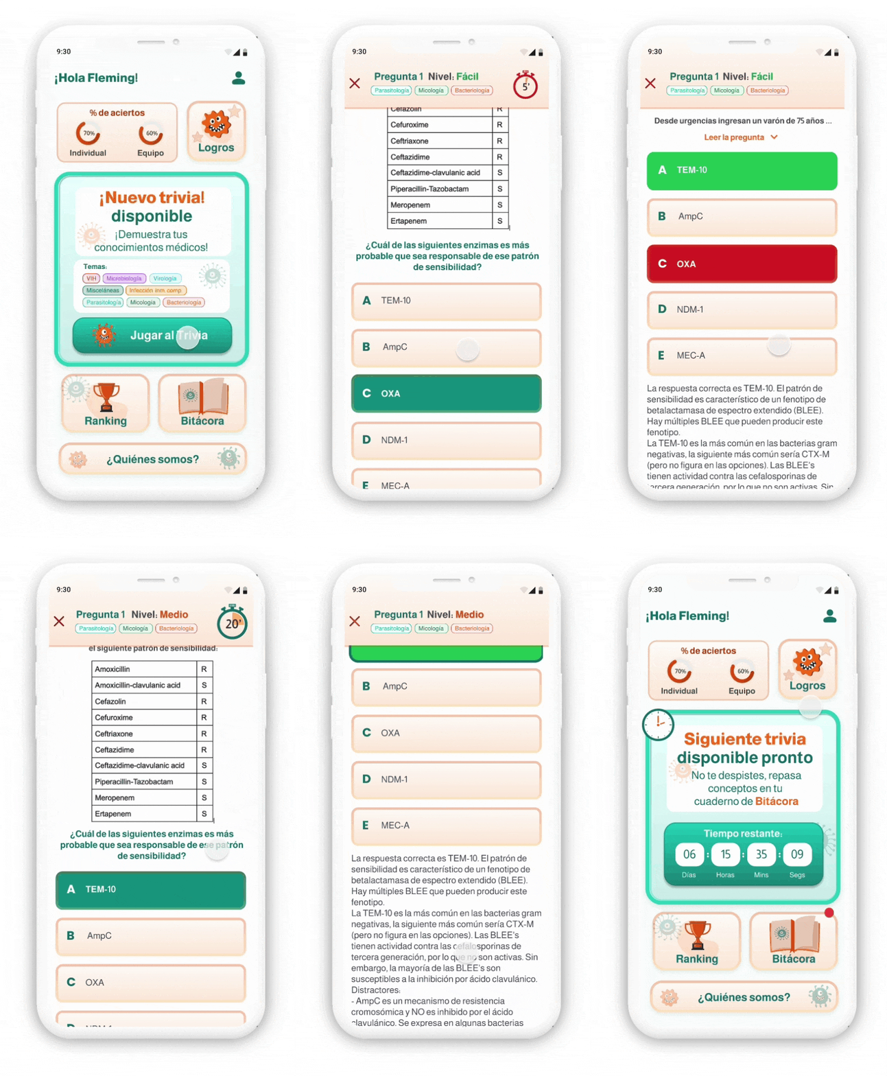
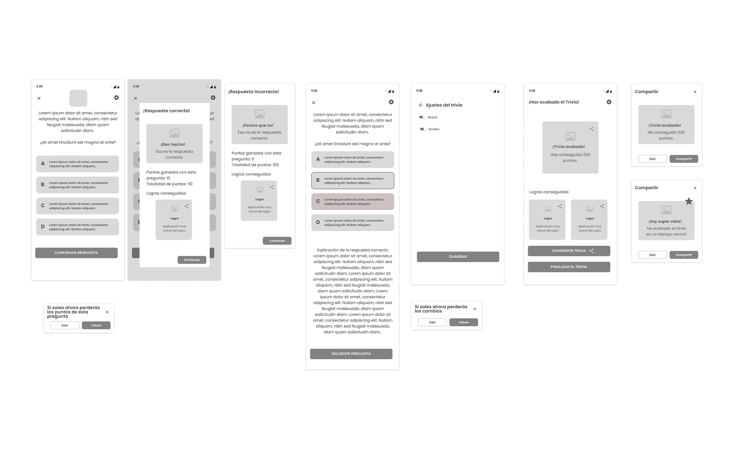
The Approach: The core trivia interface was designed around real-time interactive feedback loops. I prioritized instant, highly distinct sensory cues for positive and negative answers.
Accessibility & UX: To ensure the game is accessible to all users, feedback states never rely on color alone (green/red). They are heavily backed by explicit iconography, micro-copy, and structural layout changes. Upon completion, custom social share sheets allow users to organically broadcast their triumphs, turning a solo experience into a viral growth loop.
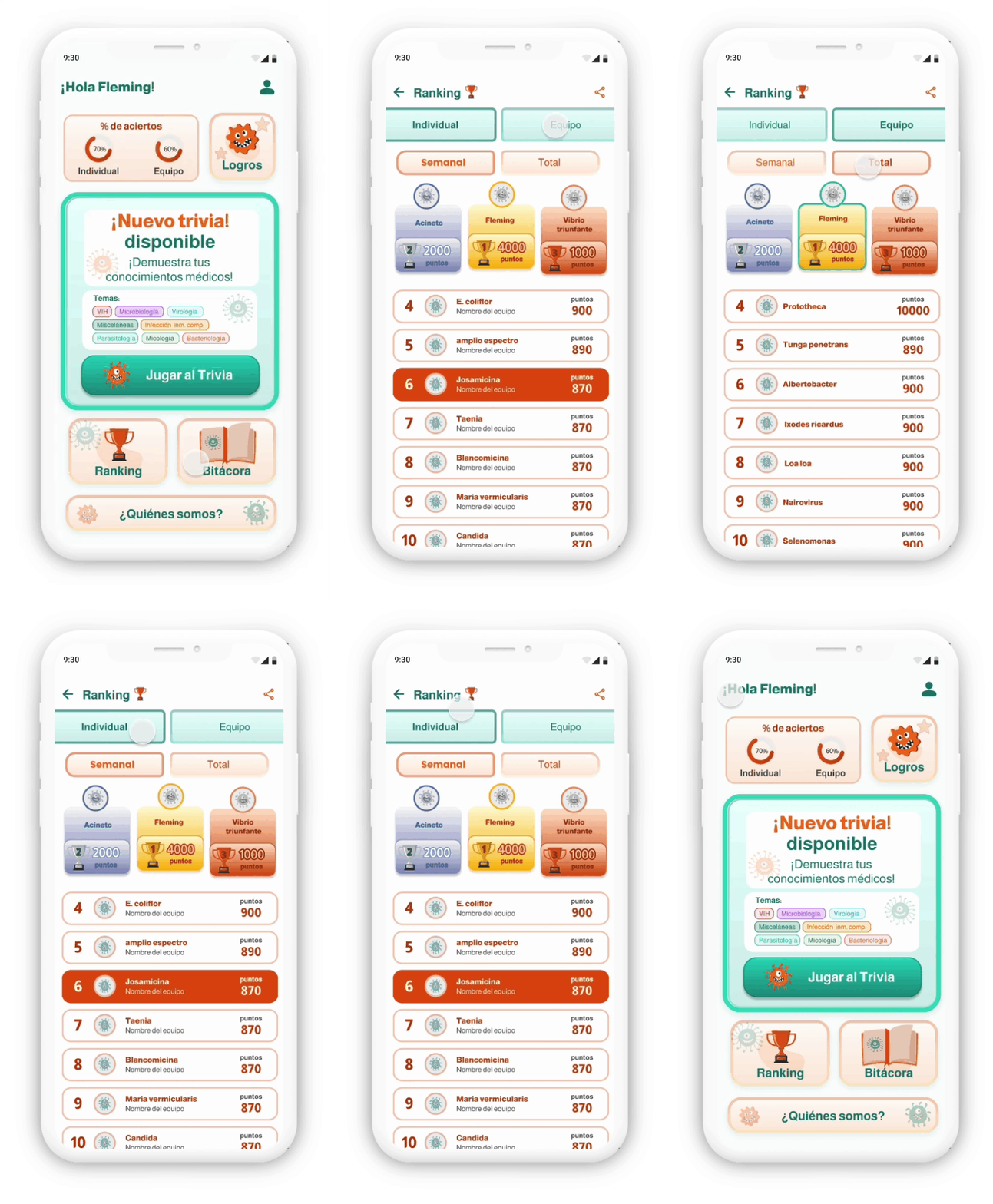
03. Team & Individual Rankings
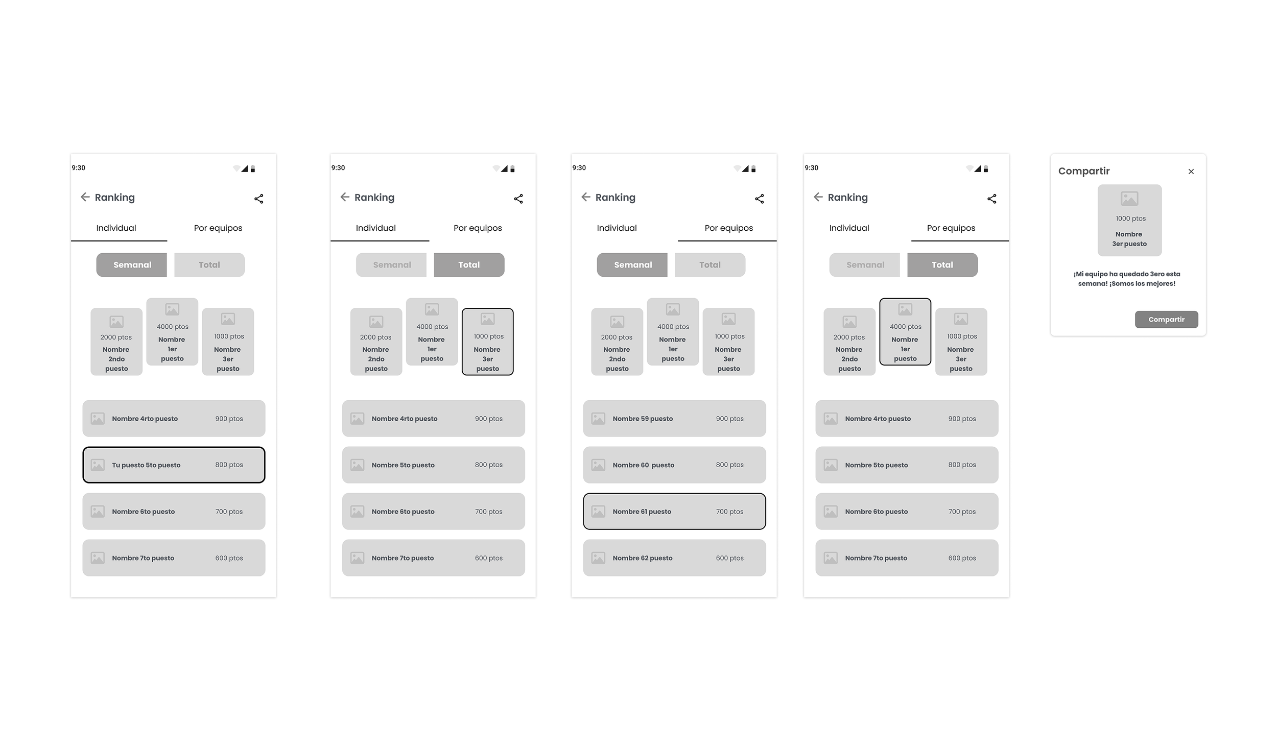
The Approach: Designed a dual-layered scoreboard system allowing users to pivot between individual performance and team-based achievements, filtered by weekly sprints or all-time milestones. The layout was optimized for mobile scannability, making it effortless for a user to locate their position, contextually view nearby competitors, and tap to share their status.
04. Visualizing Achievements & Behavioral Pull
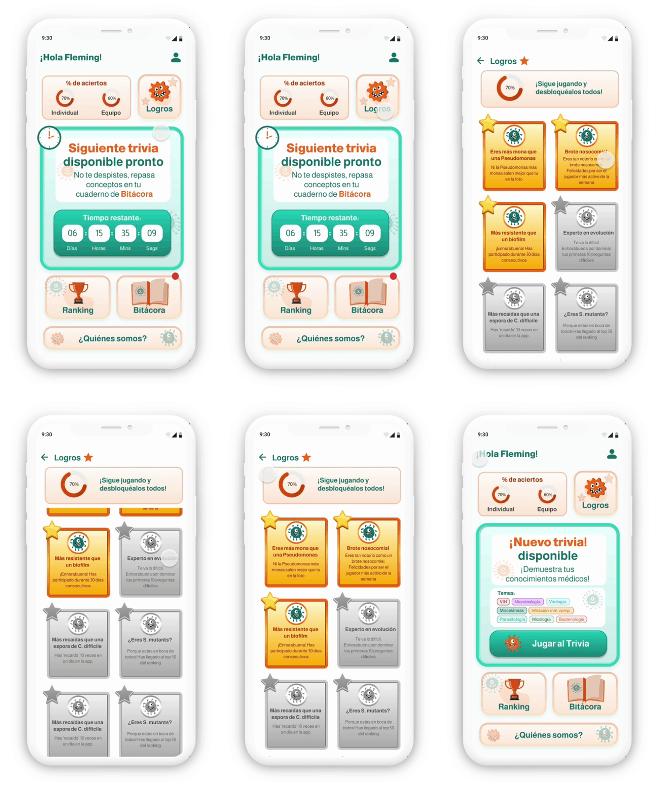
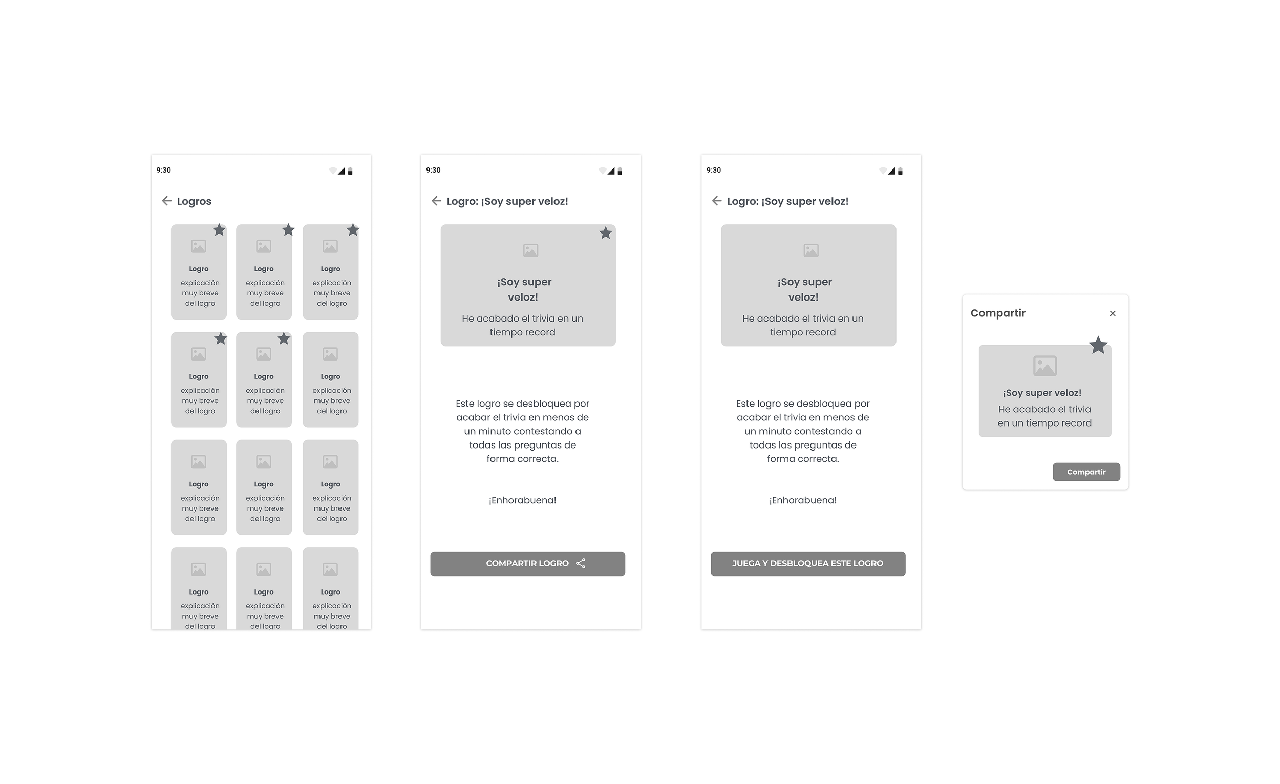
The Approach: Modeled on classic video game UX, the achievements dashboard maps out unlocked trophies against locked milestones. By treating locked achievements with a calculated visual opacity (disabled state) and descriptive tooltips, we tapped into the human psychological desire for completeness, driving user task completion and long-term retention.
05. Profile & Founders' Corner
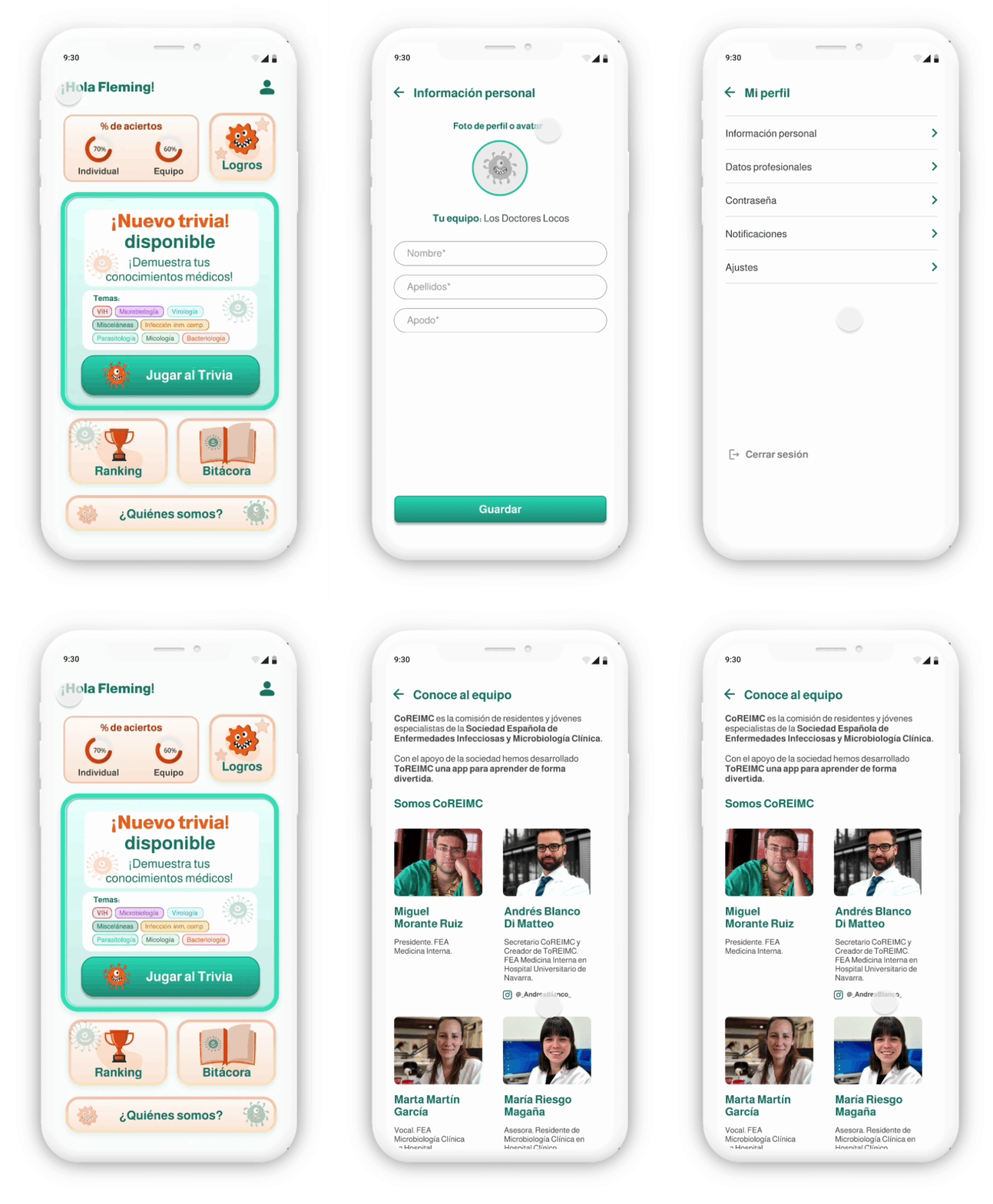
The Approach: Crafted a clean, modular profile section for swift preference management. Additionally, designed a personalized "Meet the Team" module to introduce the CEOs, humanizing the product and reinforcing the authentic, community-first ethos of the brand.
MVP Scope Management & Product Strategy
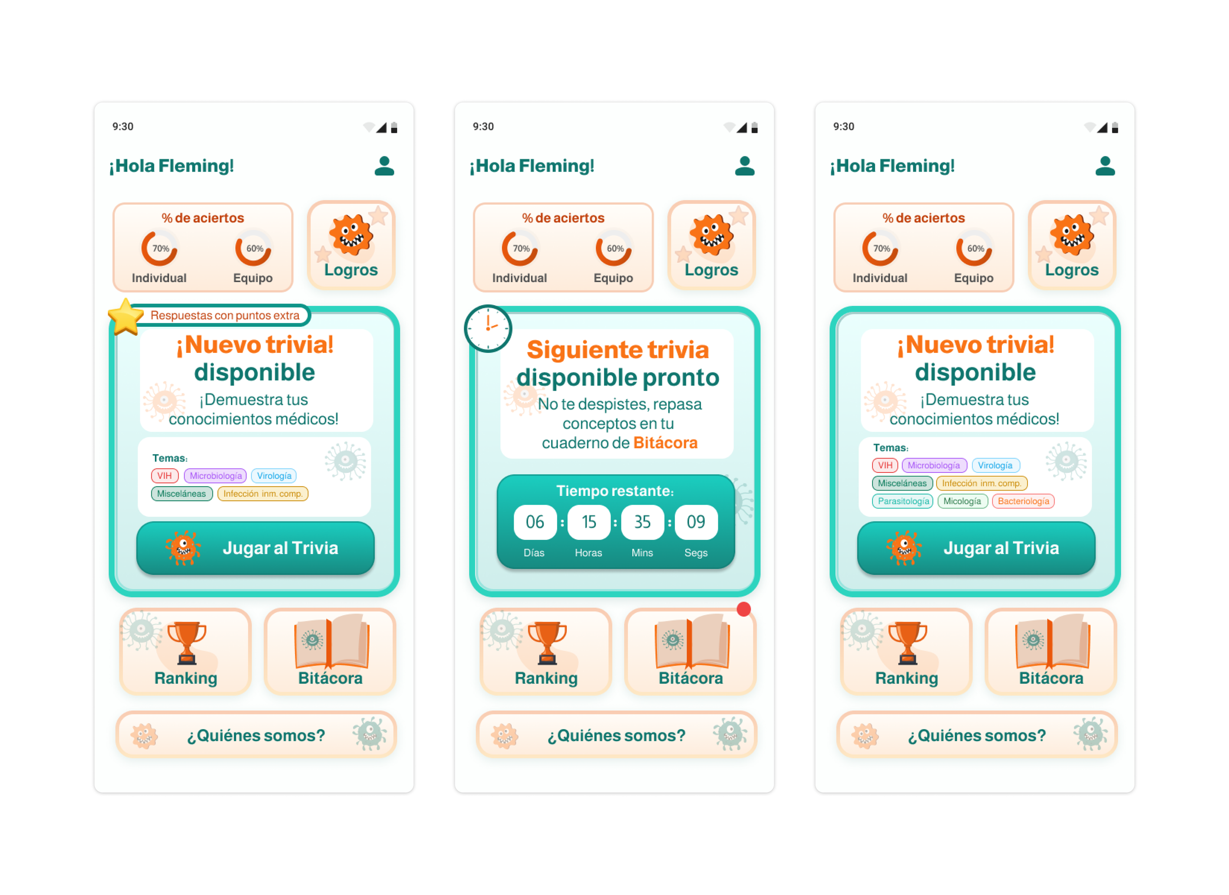
As a Senior Designer, managing product scope is just as important as the pixels. During the wireframing phase, we identified that the "Logbook" feature, while valuable, was a lower priority for the core launch loop. I advocated to exclude it from the initial MVP, safely archiving it for Phase 2 development. This strategic cut allowed the team to launch on time with a pristine, highly polished core trivia engine.

Strategic UI & UX Solutions
Gamification is About Empathy: Gamifying an app for doctors doesn't mean trivializing their work. It means respecting their limited time by creating high-contrast, lightning-fast interactions that deliver value and a moment of delight in between hospital shifts.
Designing for Phase 2: A great design system and information architecture must look ahead. Although features like the Logbook were postponed, the navigation system and UI kit were built to scale and accommodate those future modules without requiring a structural redesign.
Final UI

Final UI

Final UI
Final UI

Final UI
Final UI