LealtyCard Webapp

B2B Merchant Portal & Internal CRM

LealtyCard is a customer loyalty platform. Following the successful launch of their consumer branding, the business required a dual-facing internal manager and CRM. This web application serves as the backbone for merchants to manage their loyalty programs, analyze customer behavior, and configure app settings effortlessly.
Working with the GooApps team during an intense 3-week sprint, my role was to define the web app’s complex information architecture and translate it into a clean, highly functional digital product optimized for desktop and tablet displays.
Role
Senior UX/UI Designer
Team
Clients
GooApps
Timeline
LealtyCard
3 weeks
Strategic UI & UX Solutions
01. Holistic Information Architecture & CRM Navigation
Complex Dual-Data Management: Structuring an interface that simultaneously serves LealtyCard's core administrators and individual B2B merchants managing their own customer cohorts.
High Data Density: Preventing dashboard fatigue by transforming dense tables, metric grids, and client lists into scannable layouts.
Aggressive Timeline: Designing an end-to-end CRM portal from scratch within a 3-week delivery window while ensuring the UI was production-ready.
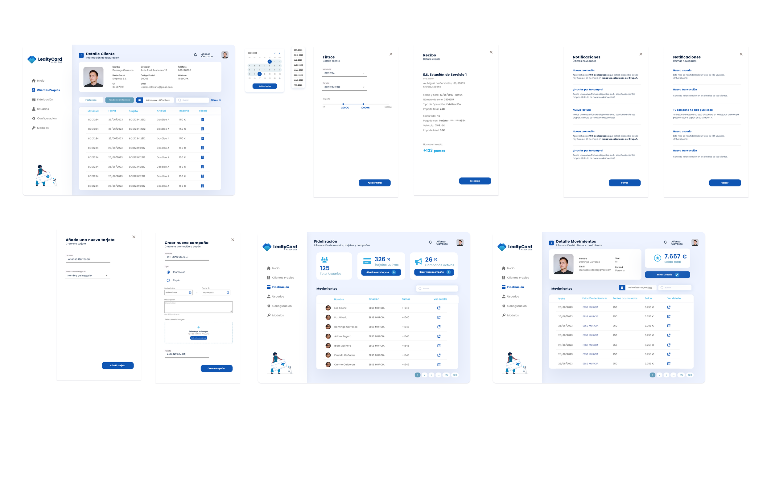
The Senior Approach: Overhauled standard data presentation by creating modular data tables. Implemented contextual filtering chips, bulk-action menus, and responsive column nesting.
Accessibility & Readability: Built tables with strict vertical rhythm and text-wrapping rules to ensure large data sets remain perfectly scannable. Row interactions utilize visible focus indicators and explicit hover states to guarantee quick and error-free internal operations.
02. Data-Dense Tables & Advanced Filtering
03. Unified Brand Scaling (From Identity to UI)
The Senior Approach: Scaled LealtyCard’s freshly established brand guidelines into a clean, professional web application system. Translated consumer visual assets into corporate-facing interface foundations by defining a strict typographic hierarchy and a unified color scheme. Interactive components (buttons, input fields, notification badges) maintain visual continuity with the consumer app while optimizing for mouse-and-keyboard desktop precision.
System Architecture & Component Strategy
Despite the short 3-week runway, I approached the interface with a long-term product mindset.
Tokens for B2B Viewports: Set up a component-driven framework in Figma utilizing layout grids specifically optimized for 1440p desktop and 1024p tablet viewports.
Reusable UI Blocks: Developed reusable table rows, modal confirmation sheets, and card layouts using Figma auto-layout and variants. This structural discipline ensured that future modules can be deployed by development without breaking visual or architectural consistency
Strategic Takeaways
B2B Tools Deserve B2C Delighters: Internal tools and CRMs do not have to be ugly or boring. Applying clean visual hierarchy, proper whitespace, and micro-interactions directly impacts the productivity and daily morale of the employees using the platform.
Speed Requires Process: Completing an entire CRM system in 3 weeks is only possible if you design systematically. Prioritizing global components and form fields early in week 1 allowed for rapid assembly of multiple dashboard screens later in the sprint.
-
![]()
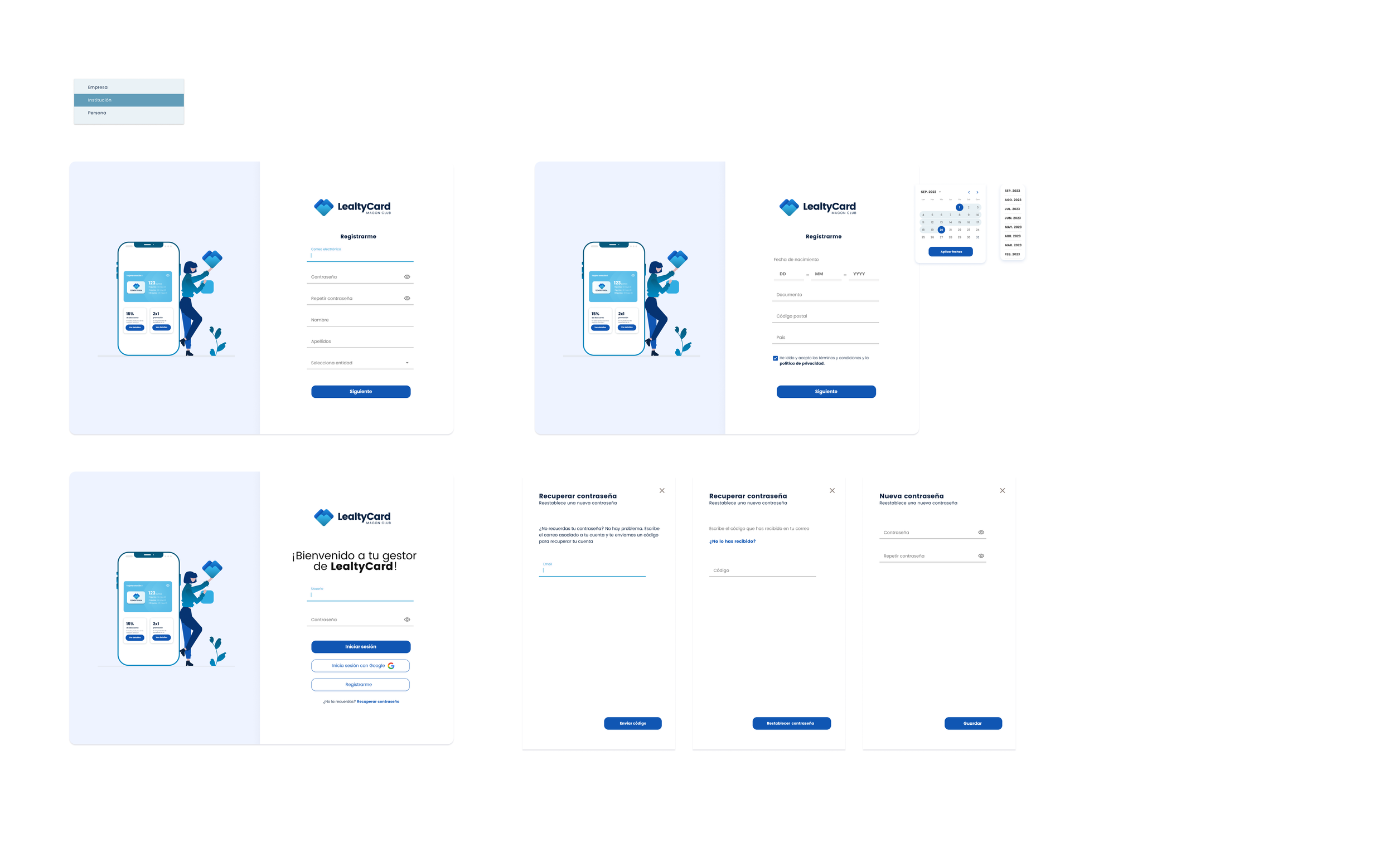
Hi-Fis Login
-
![]()
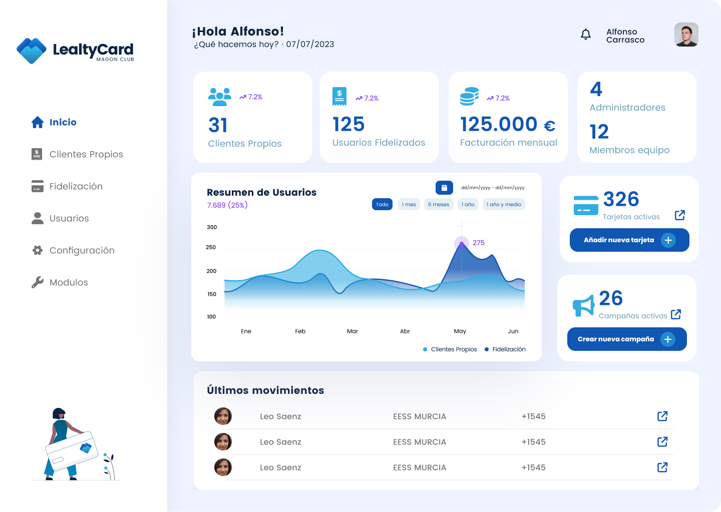
Hi Fis dashboard
-
![]()
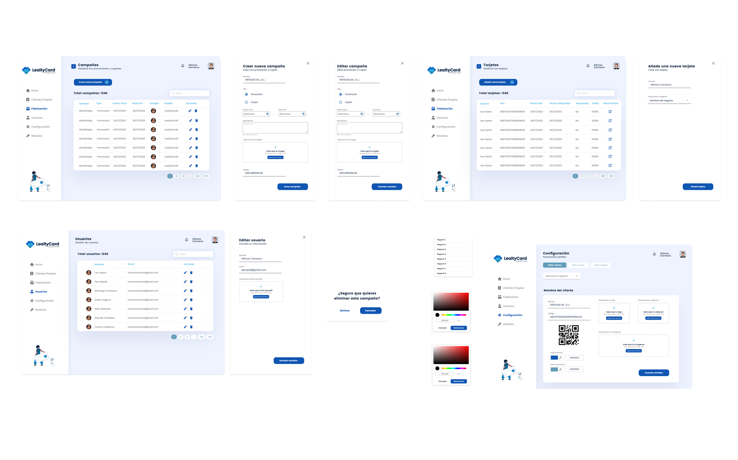
Hi Fis Management Tools
-
![]()
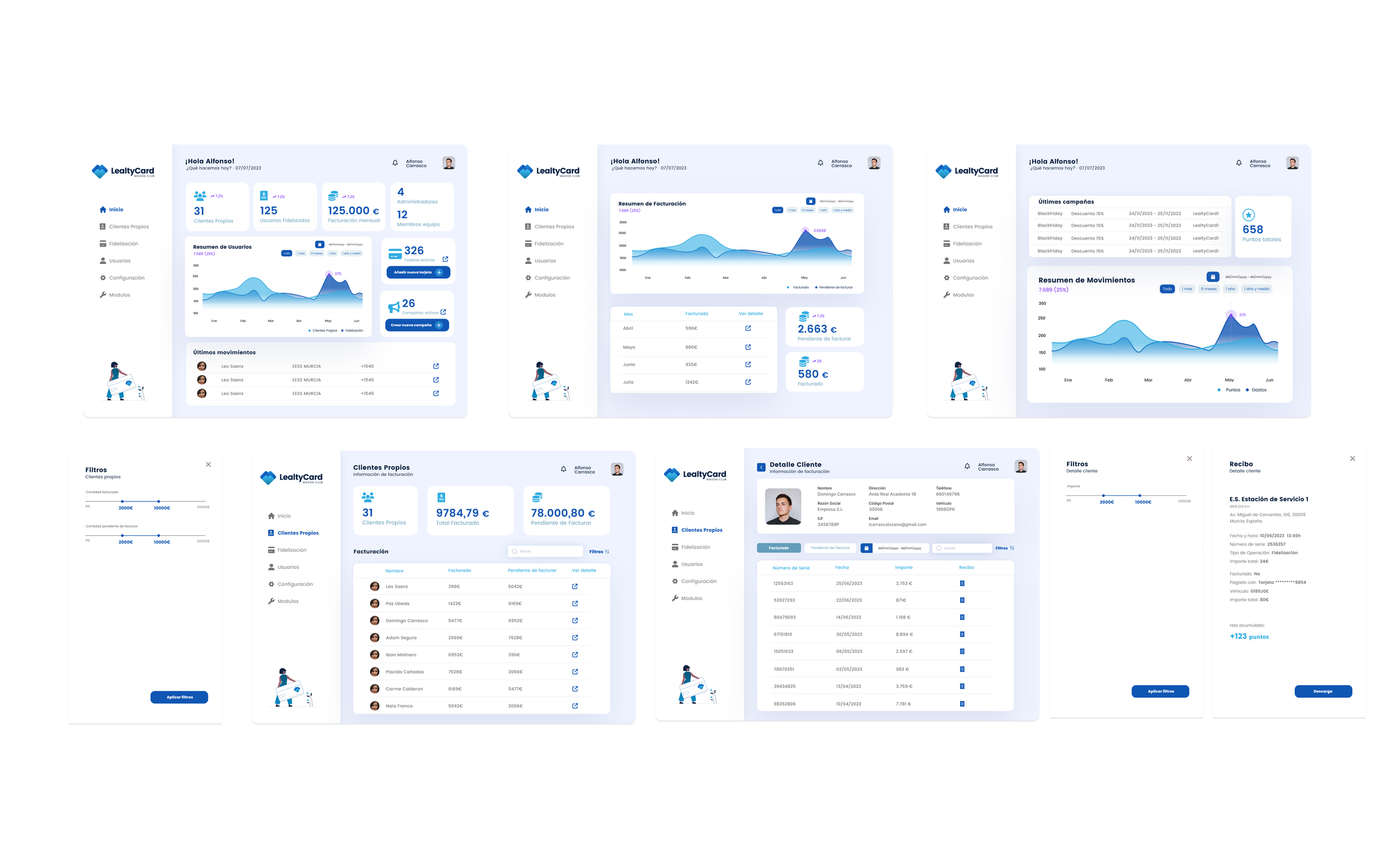
Hi Fis Settings and Clients