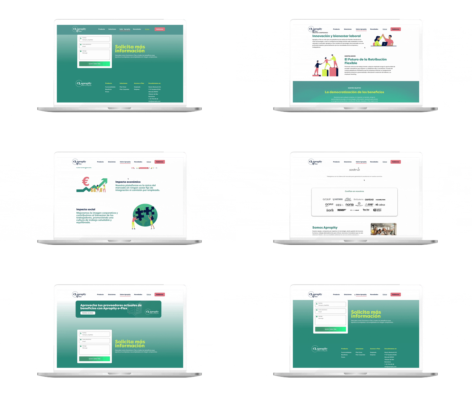
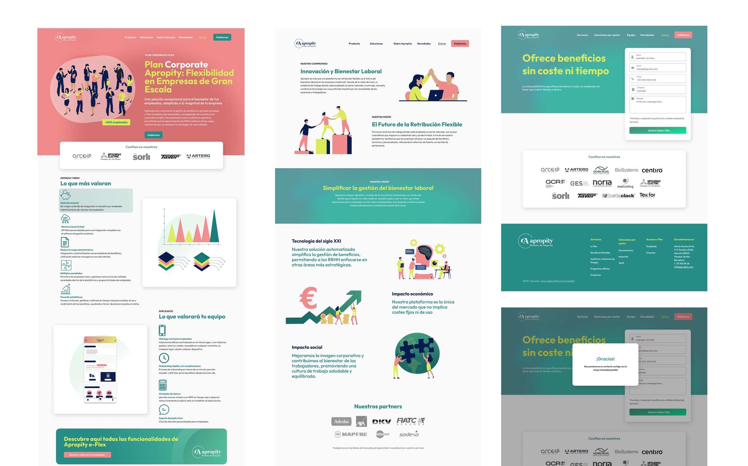
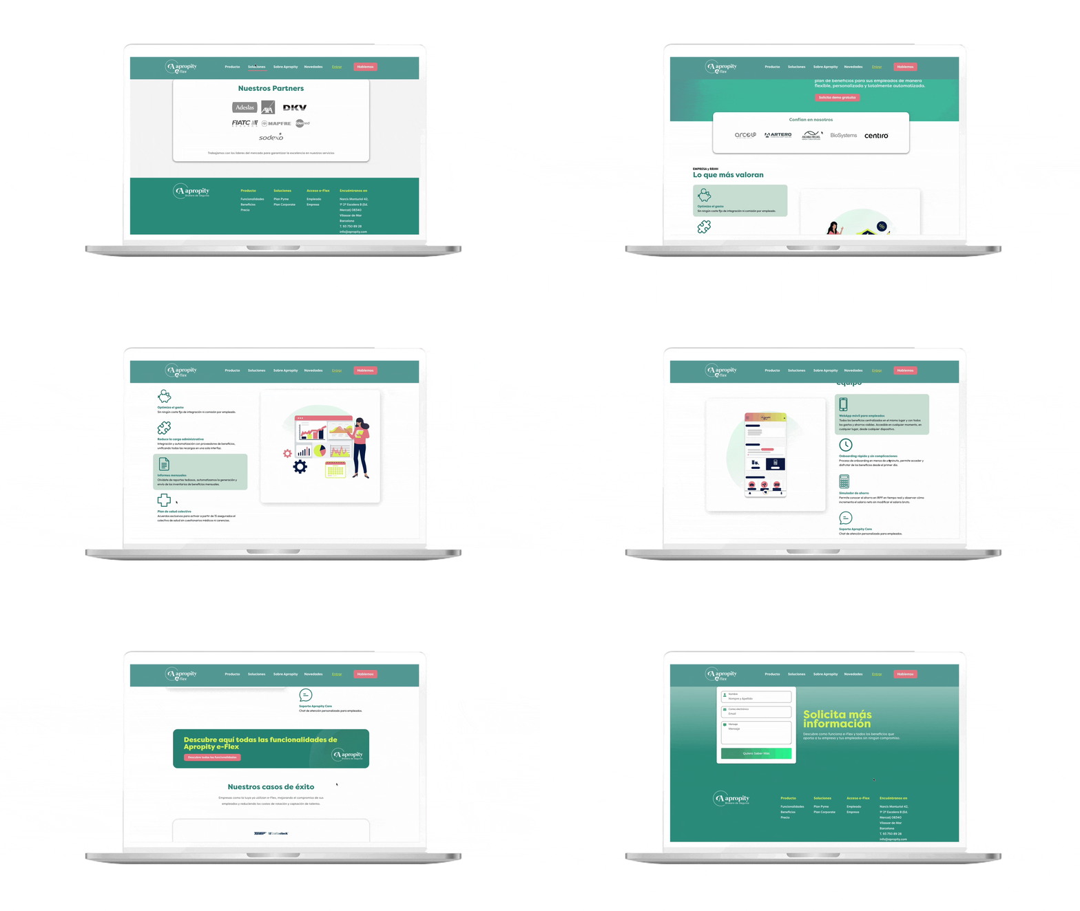
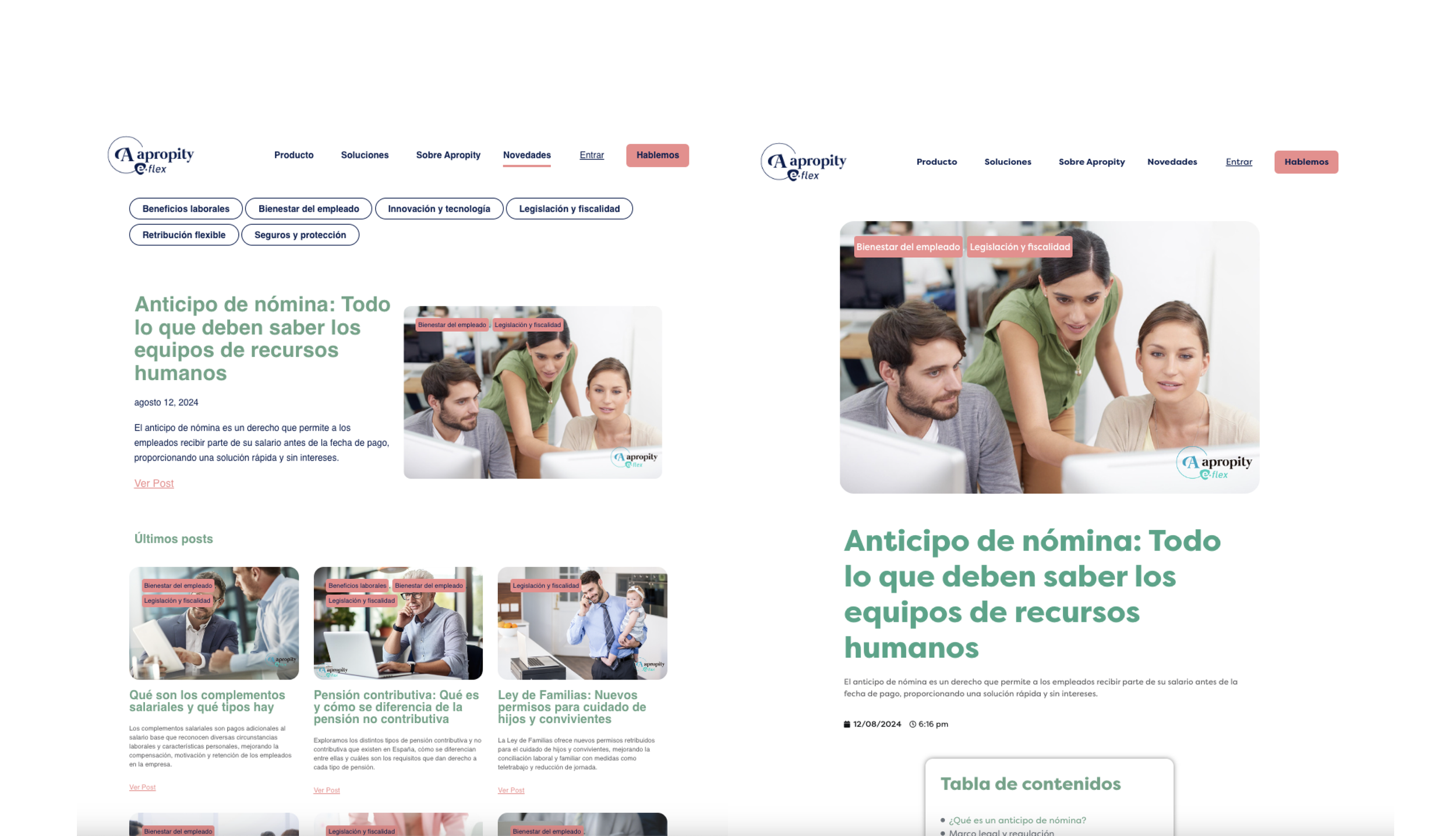
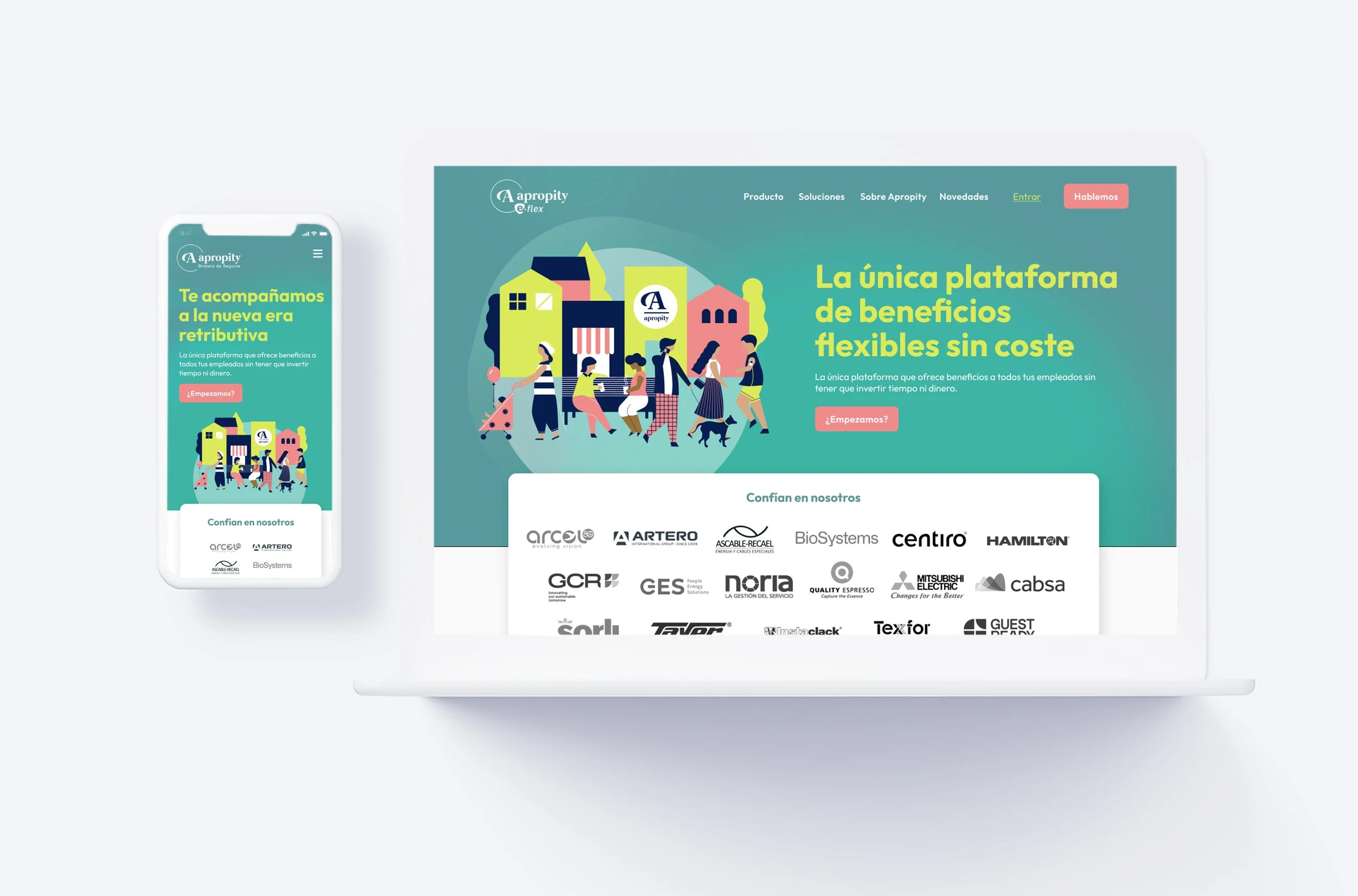
Apropity’s E-flex platform is a sophisticated enterprise web application designed to manage complex user flows and operations. The existing interface suffered from outdated visual paradigms, rigid component layouts, and fragmented brand presence that hindered user productivity.
Collaborating with the AIDDA team during an agile 4-week sprint, my mission was twofold: completely overhaul the visual identity (Rebranding) and completely redesign the platform's core web experience. The goal was to establish a unified visual architecture that effortlessly balances extreme data density with a premium, user-friendly aesthetic.


Apropity: Platform E-flex
Digital Ecosystem Overhaul
Team
Role
Senior UI & Visual Product Designer
Client
AIDDA
Apropity
Timeline
4 weeks
Targeted UI & Rebranding Solutions
01. Strategic Rebranding & Unified Visual Language
The Senior Approach: Developed a fresh, authoritative brand ecosystem tailored for an enterprise environment. I established a sophisticated color palette anchored in strict WCAG 2.2 AA contrast rules, ensuring that corporate data remains fully accessible. The new design language introduces refined typography, intentional whitespace, and subtle geometric patterns that elevate the product's market positioning.
The Product Challenges
Fragmented Brand Ecosystem: The platform lacked a cohesive identity, requiring a ground-up rebranding effort that needed to feel professional yet highly modern.
Complex Data Architecture: E-flex processes highly technical user workflows; the layout needed a dramatic structural optimization to prevent cognitive fatigue without losing critical features.
Interactive Fluidity (IxD): Translating flat, static internal operations into smooth, responsive web layouts with intuitive states for interactive data components.
02. Advanced Information Architecture & Component Design
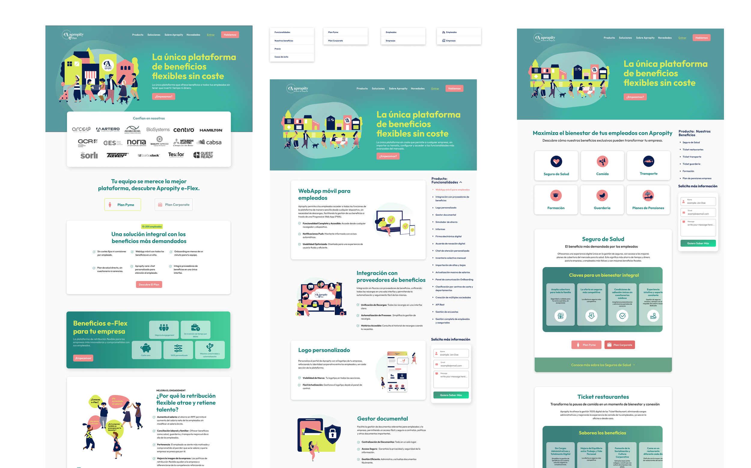
The Senior Approach: Re-engineered the core web app layout by prioritizing visual hierarchy and viewport optimization. Dense data tables, nested settings menus, and active dashboards were broken down into clean, modular UI components. By deploying explicit interactive states (hover, focus, active, disabled), the navigation feels incredibly deliberate and predictable for daily power users.
03. High-Fidelity Interaction Design (IxD) & Prototyping
The Senior Approach: Designed smooth micro-interactions and transitional animations to guide users seamlessly through complex platform states. Every dropdown, responsive modal, and slide-out panel was mapped into a fully interactive prototype to mimic true production-ready code behavior, bridging the gap between design and engineering handoff.
The Core Pillar: Scalable Web Foundations
Given the short 4-week timeline, maintaining UI consistency across a large platform required an architectural approach to Figma canvas management:
Responsive Grid Matrix: Implemented a robust 12-column flexible grid system designed to scale effortlessly across diverse desktop and laptop screens.
Component Tokenization: Converted the new branding elements directly into global Figma styles and variants. This allowed every table row, form input, and dashboard card to automatically inherit the rebranded look, keeping the layout perfectly unified.
Strategic Takeaways
Rebranding is Functional, Not Just Aesthetic: A corporate rebranding shouldn't just change the logo; it should fundamentally fix how information is read. Unifying Apropity's ecosystem proved that modernizing the visual style directly impacts how trustworthy and efficient an enterprise product feels.
Designing for Speed and Scale: Investing the first week into defining the core typography tokens and global button variants saved dozens of hours when assembling the complex internal screens later in the project lifecycle.