Senssal Solutions


Sustainable Web Experience
Senssal Solutions is an environmental tech company driven by a critical mission: making water conservation an essential and smart priority in modern society. Their existing web presence failed to convey the urgency of their message or the cutting-edge nature of their solutions.
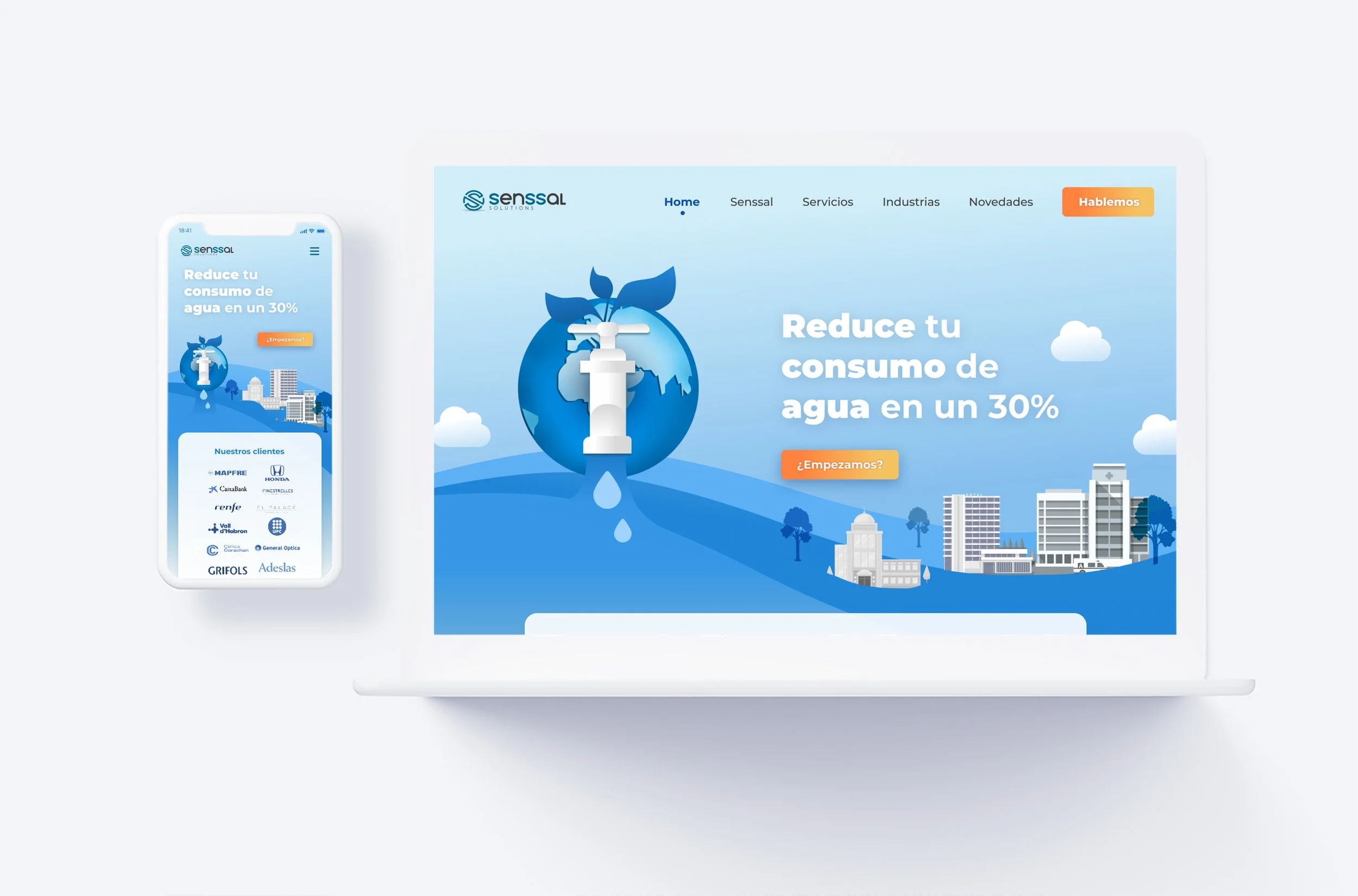
Collaborating with the AIDDA team during a 4-week sprint, my role was to overhaul their corporate website. I focused on creating a clean, modern digital ecosystem that perfectly aligns with their corporate values, translating an ecological necessity into an engaging, high-end visual narrative.
Senior UI & Interaction Designer
Role
Team
AIDDA
Clients
Senssal
Timeline
4 weeks
Aesthetic Alignment: The previous platform felt dated. The challenge was to craft a modern, clean, and professional visual direction that resonated with both corporate B2B clients and eco-conscious stakeholders.
Abstract to Visual Storytelling: Transforming dense environmental data and mission statements into a compelling, digestible user journey that inspires action.
Interactive Fluidity (IxD): Designing purposeful micro-interactions and transitions that mimic the fluid, clean nature of the brand’s core subject: water.
The Product Challenges
Strategic UI & UX Solutions
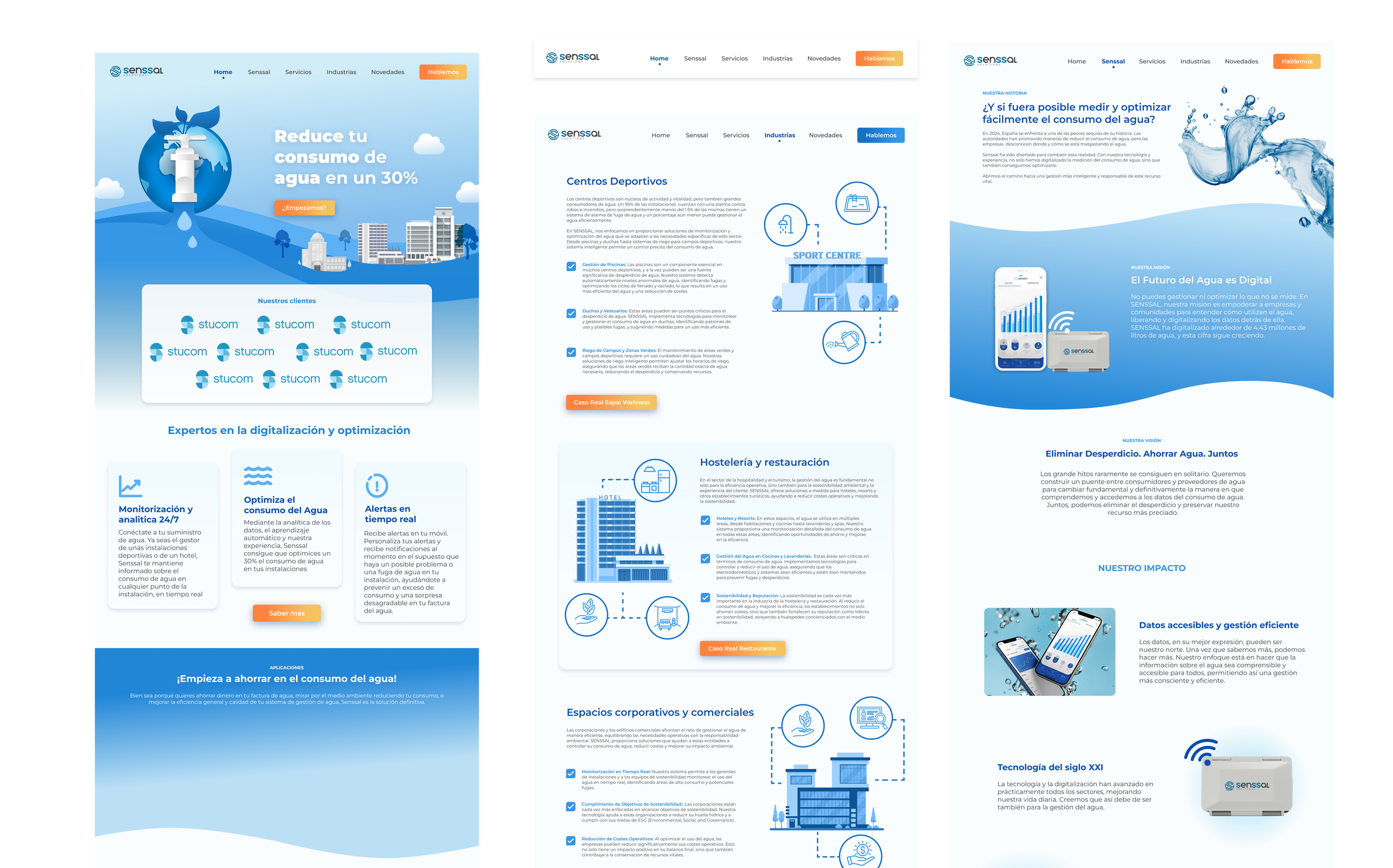
01. Purpose-Driven Visual Architecture & Clean Design
The Senior Approach: I established a minimal, highly intentional user interface that reflects purity and clarity. By utilizing a pristine layout with balanced negative space, the message of water conservation takes center stage. The color palette was refined to stay loyal to Senssal’s corporate core while infusing fresh, modern tones that enhance digital legibility and trust.
02. Fluid Interaction Design (IxD) & Micro-interactions
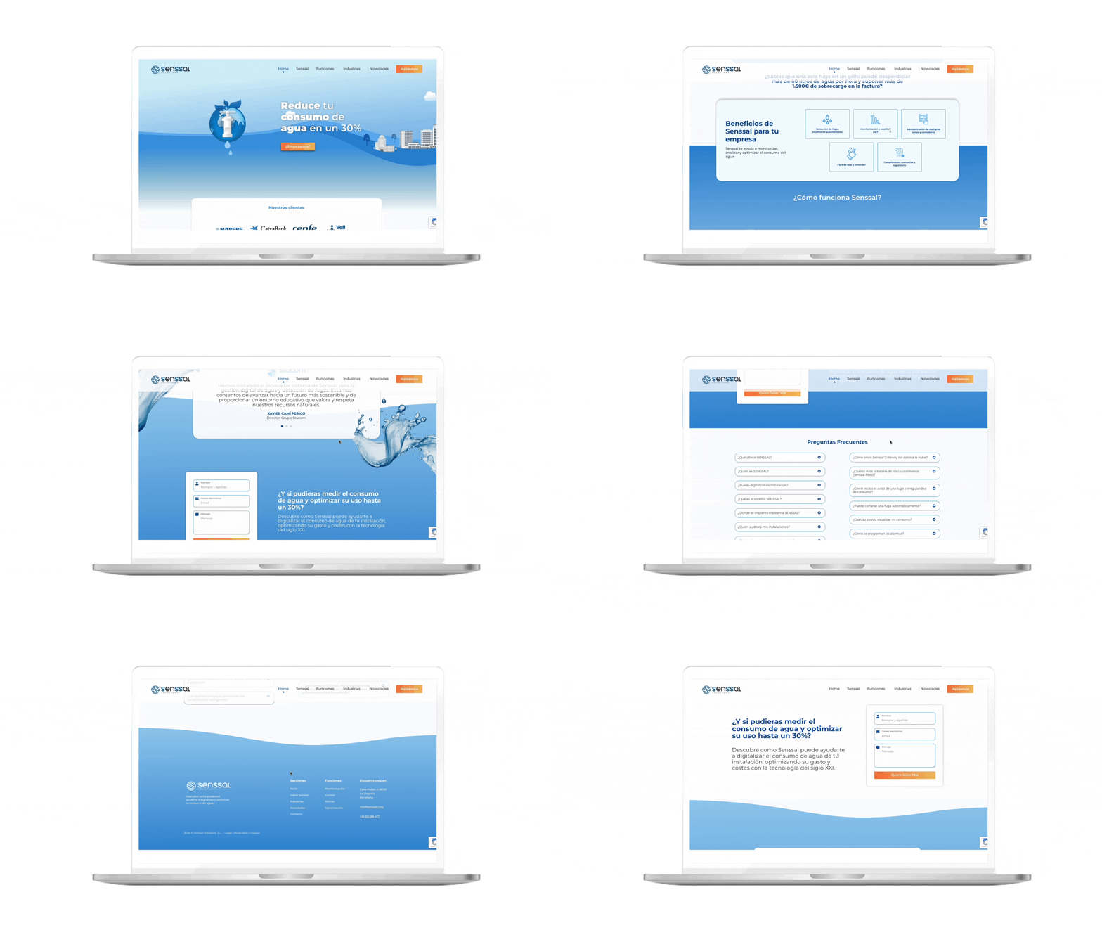
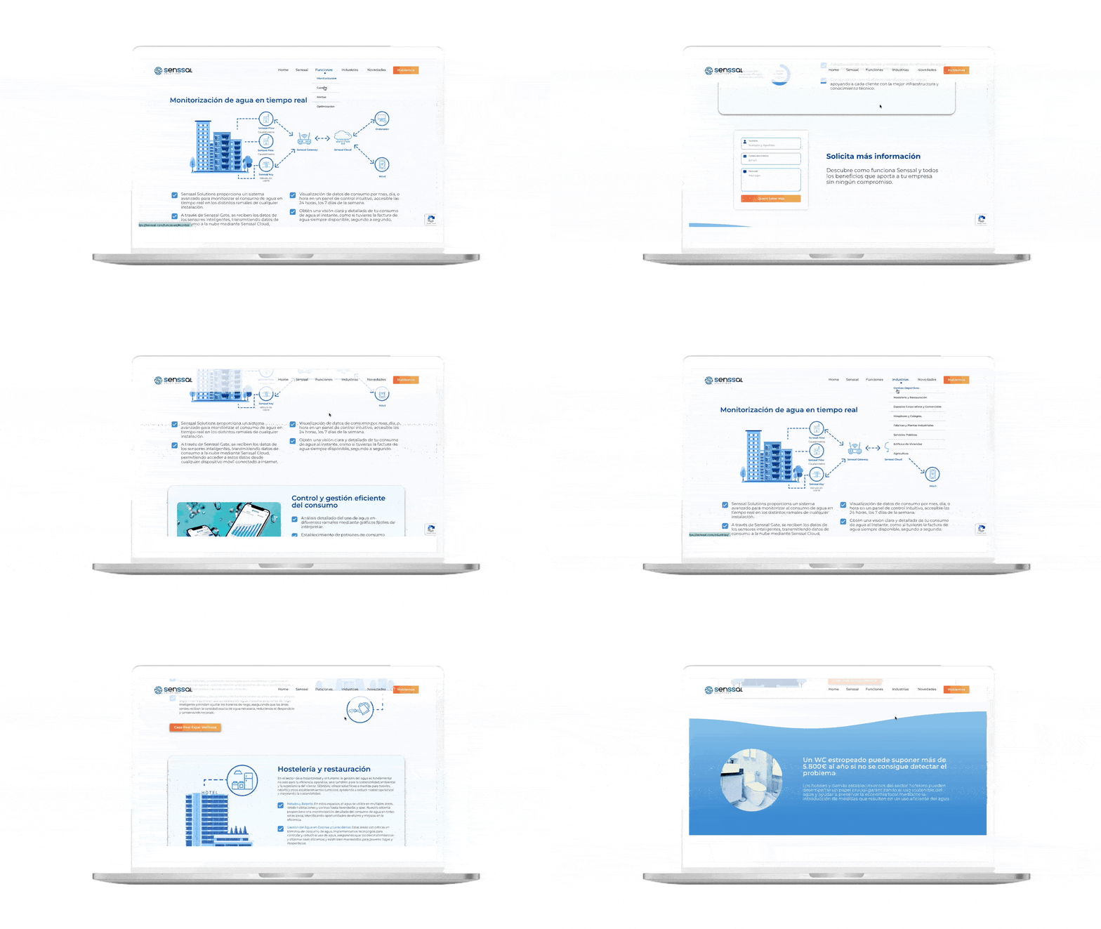
The Senior Approach: Since the website centers on water conservation, I injected subtle, fluid motion patterns into the interface elements. Hover states, page transitions, and scroll-triggered animations were meticulously designed to guide the user’s eyes smoothly down the page, significantly increasing user engagement and reading retention.
03. High-Fidelity Prototyping & Handoff
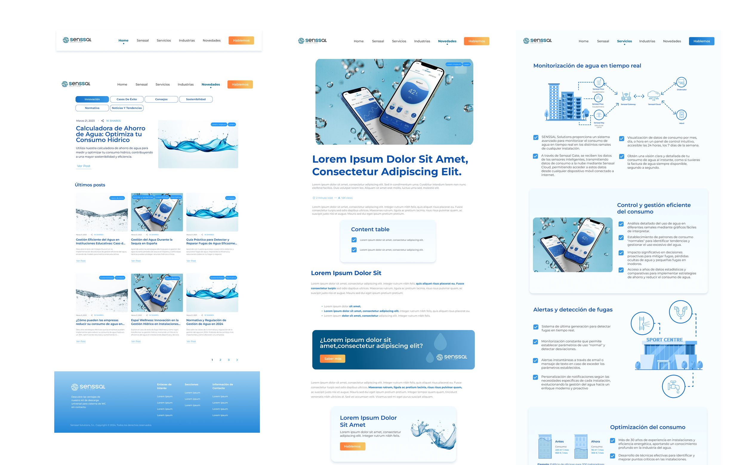
The Senior Approach: Developed a comprehensive, interactive prototype in Figma that perfectly maps out the responsive behavior across desktop and mobile devices. Every interactive component was fully articulated with proper transition speeds (200ms–300ms ease-in-out curves) to ensure the development team could implement the cinematic, premium feel of the design flawlessly.
To execute this 4-week project efficiently, I built a modular visual toolkit:
Typography Matrix: Selected crisp, high-legibility typefaces that establish an authoritative yet approachable tone, ensuring hierarchy remains sharp even in text-heavy informational blocks.
Custom UI Elements: Created a library of custom icons, card containers, and button variants designed on a tight spacing grid. This allowed for lightning-fast layout assembly and a highly polished end-product.
Component & Style Foundations
Strategic Takeaways
Simplicity Requires Precision: When designing a "clean" website, whitespace becomes an active component. Every pixel, margin, and alignment choice must be perfect because there are no heavy graphic decorations to hide behind.
Emotion Drives Action: Aligning the aesthetic directly with the company's objective showed that a corporate website doesn't have to be dry. Merging beautiful UI with strong mission storytelling makes a brand's vision unforgettable.