GooApps Ventures: Break the Gap

High-Velocity Landing Page

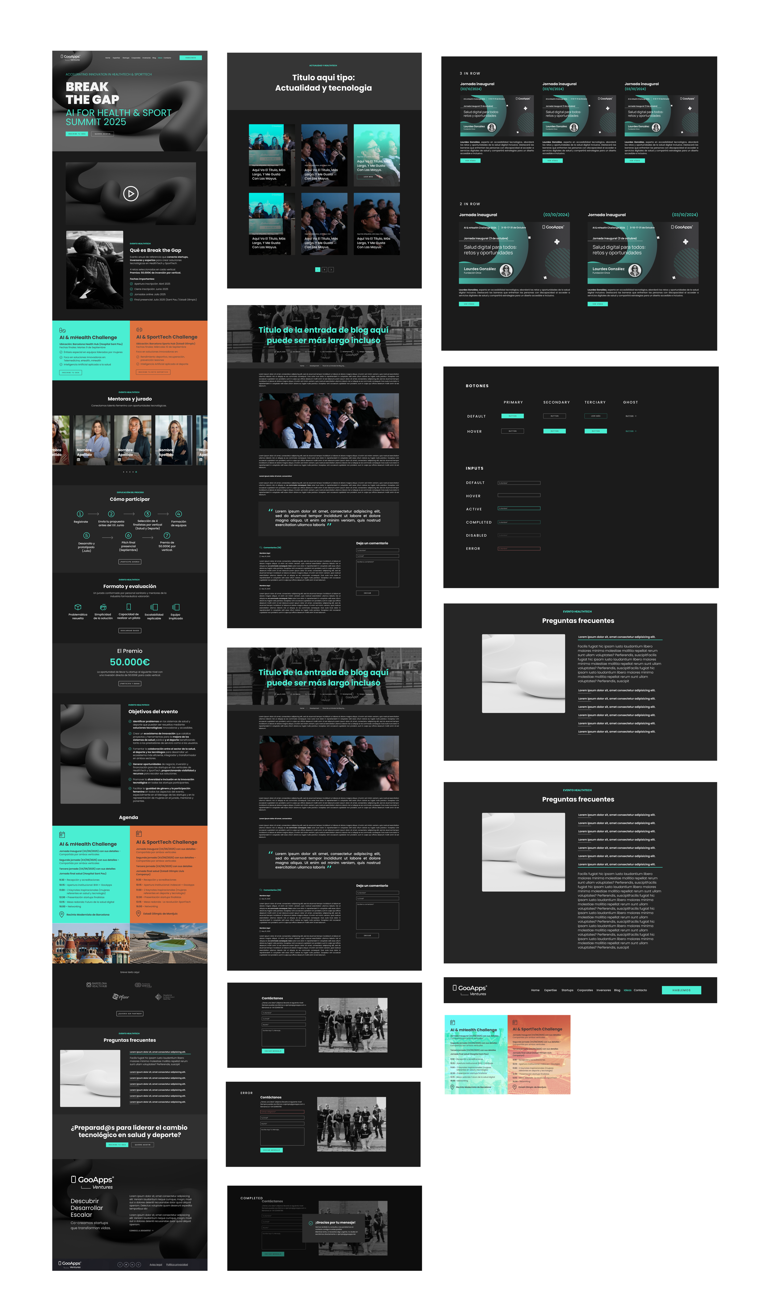
GooApps Ventures launched "Break the Gap," an elite program designed to attract, fund, and scale innovative startups in the health and sports technology sectors. To drive high-tier applications for their upcoming pitch event, they required a high-converting, visually striking landing page. The digital presence needed to project cutting-edge innovation, absolute institutional trust, and high-tech authority.
Operating as the dedicated UI Designer in a hyper-focused 3-day sprint, my mission was to inherit GooApps' established brand foundations and rapidly scale them into a bold, minimal, and high-impact web experience optimized for startup founders.
Timeline
Role
Senior UI Designer
Client
GooApps
3 days
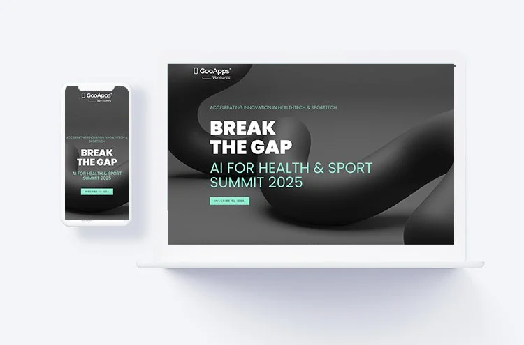
Extreme Timeline Constraints: Designing a fully articulated, responsive, high-fidelity landing page from concept to dev-ready handoff in just 3 days.
Scaling an Existing System: Injecting a futuristic, bold personality into a pre-defined design system without breaking corporate brand alignment.
Conversion-Centric Layout: Balancing a premium visual narrative with an optimized user flow that seamlessly guides busy founders toward the application CTA.
The Product Challenges
Targeted UI & Conversion Solutions
01. High-Contrast Visual Hierarchy & Tech Aesthetic
The Senior Approach: To capture the attention of tech-forward innovators, I engineered a high-impact, bold, and minimal layout. Utilizing dramatic typographic contrast, sharp geometric structures, and a vibrant color palette, the interface naturally directs the eye through the event's value proposition. Generous whitespace was used strategically to let high-tech visual elements breathe while maintaining an elite corporate feel.
02. Conversion Rate Optimization (CRO) & Layout Adaptation
The Senior Approach: Every section was anatomically structured for maximum readability and conversion. I mapped out an intuitive narrative arc—from the hook hero section down to the funding milestones and final application form. Interactive elements and crisp call-to-actions (CTAs) utilize explicit hover and focus states, minimizing user friction and maximizing sign-up intent.
What I Delivered
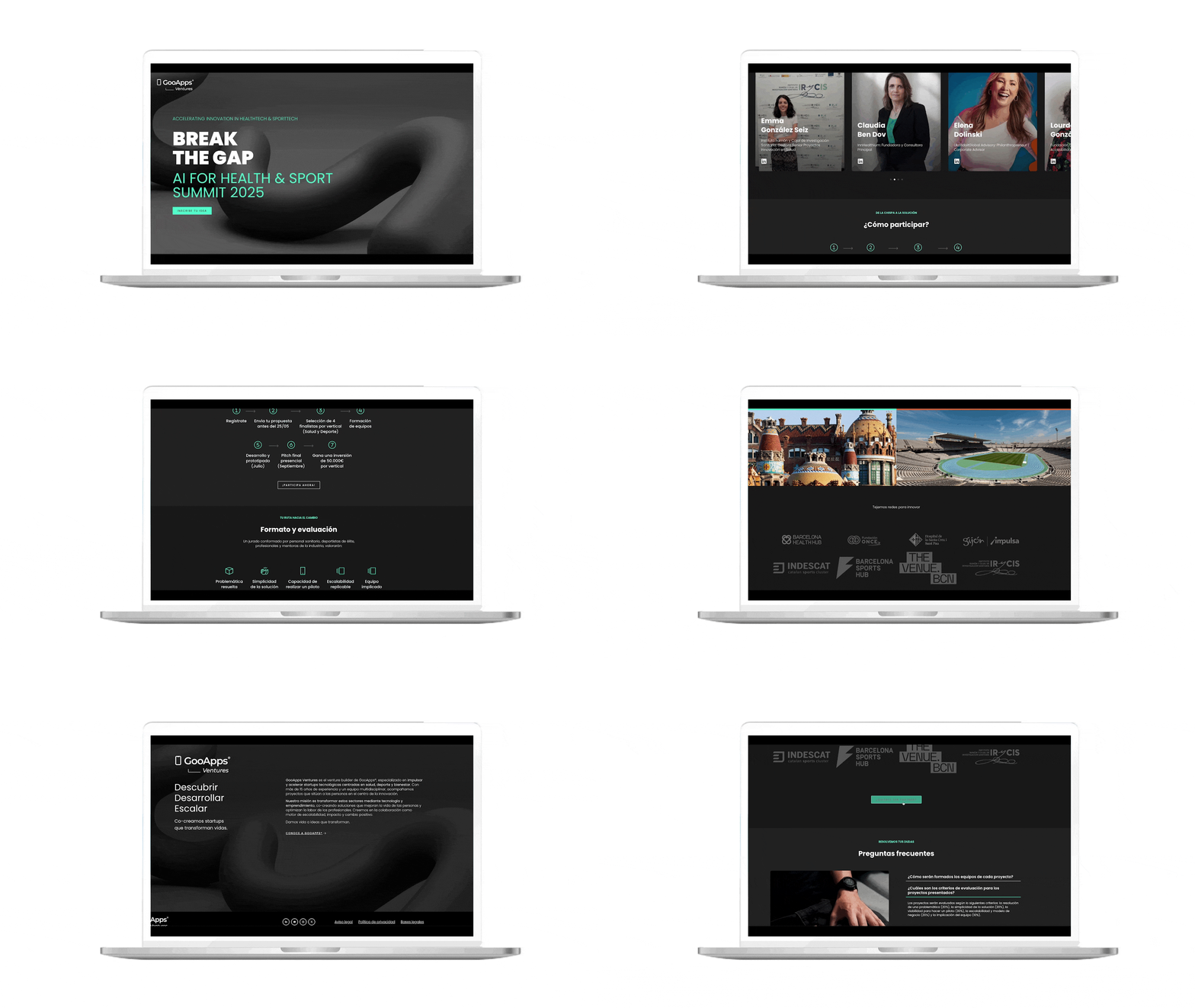
High-Fidelity UI Screens: Production-ready responsive layouts optimized for web and mobile viewports.
Design System Scaling: Visual refinements and layout adaptations that pushed the existing component library into a bolder visual territory.
Component Governance: Rapid creation of custom cards, interactive event timelines, and form fields perfectly aligned with the parent design system.
CRO Optimization: Sections meticulously structured to balance high-end aesthetics with fast scannability and clear application pathways.
Constraints Breed Creativity: A 3-day timeline leaves zero room for second-guessing. Having an existing design system wasn't a restriction; it was my launchpad. It allowed me to skip basic wireframing and spend 90% of my time refining micro-typography, spatial layouts, and visual contrast to maximize brand perception.
The Value of Micro-Details: When a layout is minimal, small details carry the entire weight of the design. Precise control over 4px/8px spacing grids, subtle drop shadows, and sharp border radiuses are what transformed a standard corporate landing page into an premium digital experience.
Strategic Takeaways