

Oncologym


Empathetic Digital Post-Treatment Care
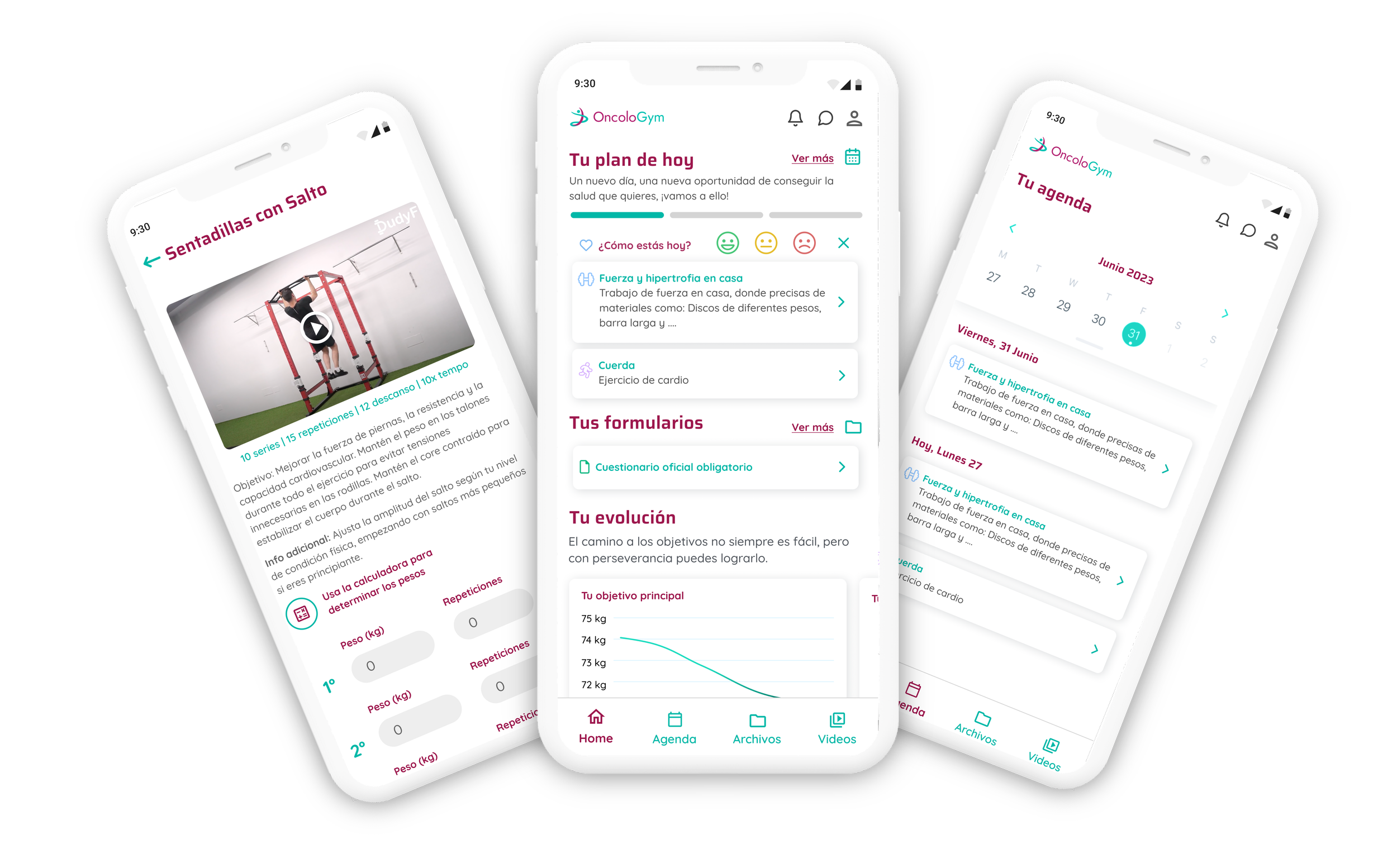
Oncologym is a specialized mobile ecosystem engineered to support oncology patients through their critical recovery journey and long-term post-treatment follow-up. The platform empowers survivors by promoting physical and mental well-being, providing tailored clinical resources, and offering structured daily guidance.
As the sole UX/UI Designer within the GooApps team during this 5-week sprint, I conceptualized, designed, and prototyped the entire interface. My mission was to translate a complex, highly sensitive emotional journey into an empowering digital tool that balances clinical security with human-centered empathy.
Senior Product & UX/UI Designer
Role
Team
Clients
Timeline
GooApps
Oncologym
5 weeks
The Product Challenges
The Post-Treatment Void: Addressing the profound sense of isolation, confusion, and lack of structural physical or emotional support that patients experience once active clinical treatment ends.
Cognitive and Physical Friction: Designing for users who routinely experience "chemo-brain" (cognitive fog), severe chronic fatigue, and reduced motor skills or tactile sensitivity.
The Trust Deficit: Establishing a calm, secure, and reassuring visual tone that alleviates the constant fear of relapse while encouraging daily healthy habits.
Research Insights & Behavioral Strategy
Through rigorous desk research and qualitative analysis of oncology patient testimonials, I mapped out critical post-treatment friction points:
A vital user requirement for structured, low-barrier daily routines.
High psychological vulnerability, requiring continuous intrinsic motivation without causing performance anxiety.
These behavioral insights directly dictated our product feature prioritization and established a strict, comforting tone of voice across the ecosystem.
Targeted UI & Accessibility Solutions
01. The Personalized Compass (Empathetic Dashboard)
The Senior Approach: Instead of overwhelming vulnerable users with data-heavy metrics, the home interface opens with a clean, welcoming dashboard utilizing cognitive-friendly daily prompts. I established an intentional information architecture that organizes daily wellness activities into three clear pillars: physical, emotional, and nutritional recovery.
02. Frictionless Progression & Cognitive Pacing
The Senior Approach: Designed simple, high-reward interaction patterns like micro-mood tracking and achievement badges to celebrate minor daily triumphs. Navigation loops are completely linear, allowing users to consume curated medical articles, track habits, or access breathing exercises without ever getting lost or feeling cognitively drained.
The Core Pillar: Trauma-Informed Design System
For Oncologym, the visual design system was treated as a therapeutic asset. Every component was optimized to support users experiencing physical or emotional exhaustion.
[Soft Tone Palette] ──► [Enhanced Typography] ──► [Generous Tap Targets]
(Calm, High Contrast)     (Saccadic Readability)        (Frictionless Motor Control)
❖ Chromatic Psychology & Strict Contrast (WCAG 2.2)
Curated a visual palette of calm, soft tones and rounded geometric elements designed to trigger feelings of warmth, safety, and clinical authority.
All background-to-text combinations were systematically tested to pass a minimum WCAG 2.2 AA (and in core areas, AAA) contrast ratio, ensuring perfect legibility under direct sunlight or during periods of visual fatigue.
❖ Inclusive Typography & Spatial Math
Selected accessible typefaces with open counters and distinct character shapes to prevent letter crowding during low-acuity visual states.
Implemented an expansive baseline grid ensuring generous whitespace. Interactive tap targets (buttons, pills, cards) were scaled to a minimum of 56px vertical height, vastly exceeding standard guidelines to accommodate users experiencing hand tremors or peripheral neuropathy
High-Fidelity Artifacts & Delivery
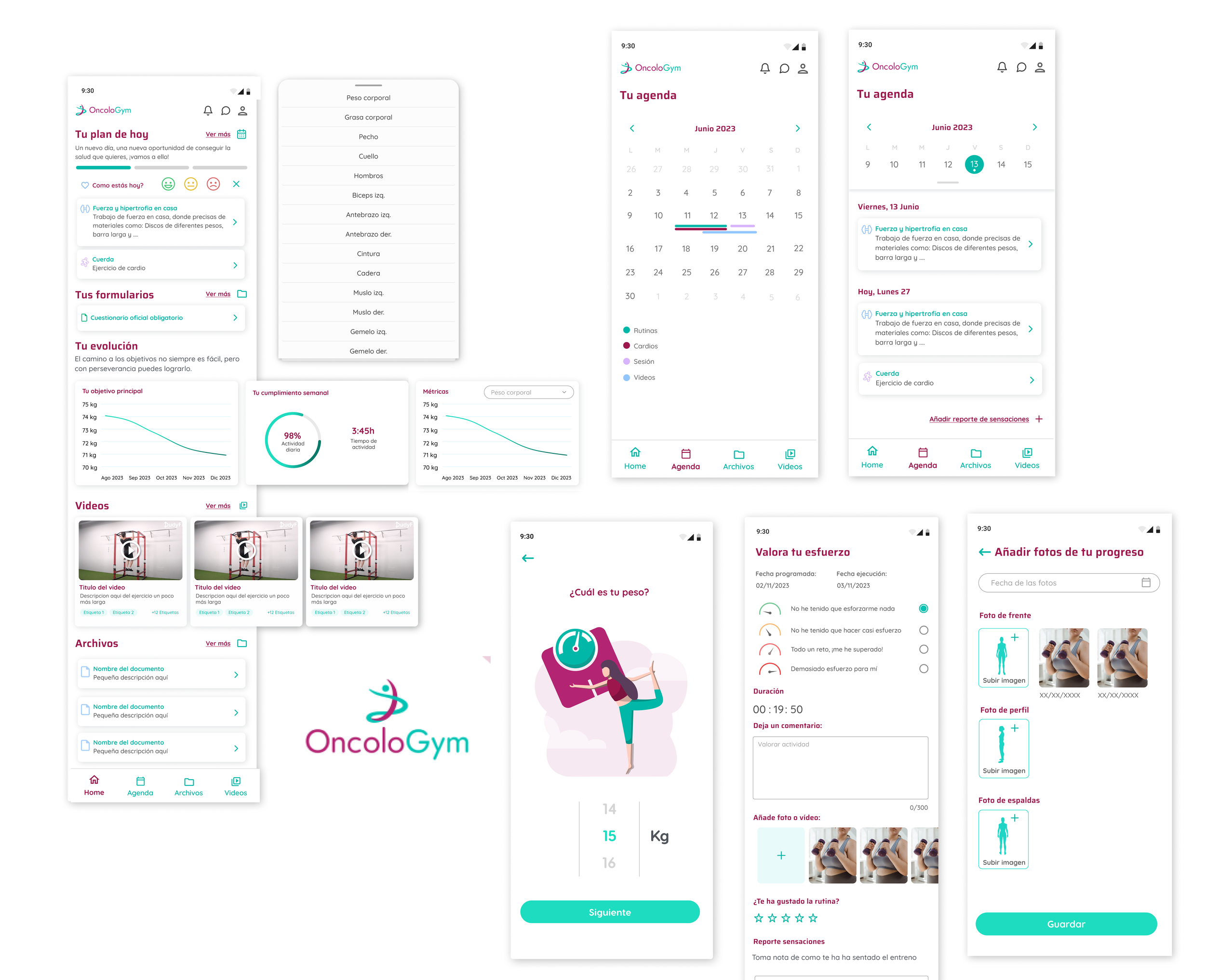
The final interactive prototype successfully showcases a production-ready application flow:
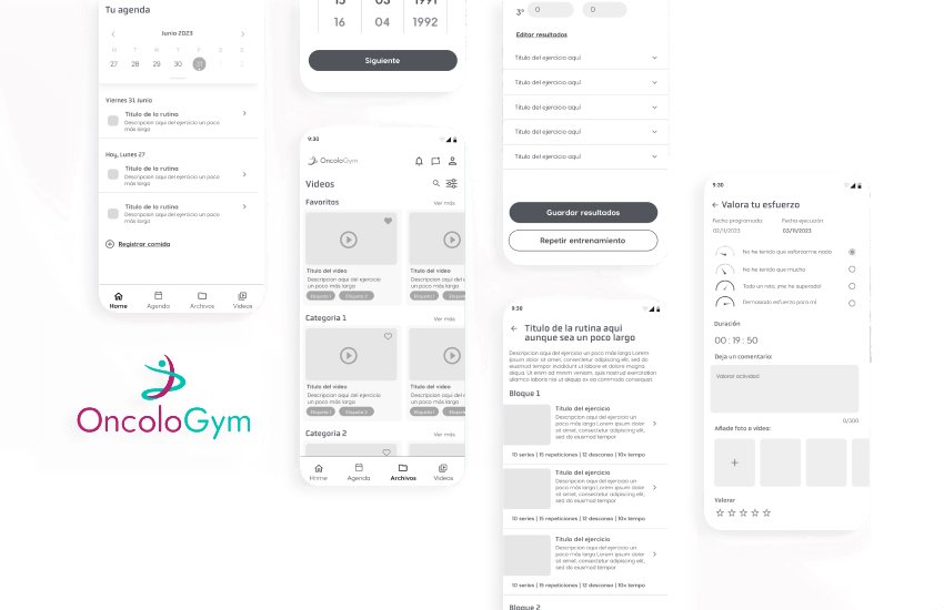
Lo-Fi Wireframe Stage: Used early in the process to map out clean information layouts and get rapid feedback on accessibility loops.
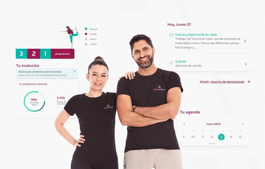
Hi-Fi Dashboard & Prompts: A clean, soothing layout welcoming the user with clear daily priorities.
Interactive Wellness Kits: Effortless access to meditations, physical tracking tools, and contextual reminders.
Strategic Takeaways
Empathy is a Measurable Standard: Designing Oncologym reinforced that human-centered design means looking past raw aesthetics. True empathy in digital health means understanding that a layout decision—like text size or button placement—directly impacts whether a vulnerable user feels supported or defeated by technology.
Defensive Design in HealthTech: When designing for users in recovery, clarity must trump cleverness. Removing unnecessary interface choices, ensuring flawless screen-reader hierarchy, and protecting the user from error states is what elevates a standard application into a truly supportive companion.