
Mi Gasolinera

UX UI APP REDESIGN

There was a need to design an efficient manager for gas station owners, and 4gl proposed a perfect solution: this software in the form of an app right at your fingertips. However, the app was old and not usable on mobile. As a UX/UI designer, I ensured the redesign was highly usable, intuitive, and visually appealing. I worked on everything from information architecture and user flows to the final interface, prototype, and interaction design.
Rebranding
UI Design
UX Design
Role
Team
Clients
Time
GooApps
4GL
5 weeks
IxD Design
Prototyping

Original web app - Before redesign

Problems
Many users, most of whom were frustrated because on mobile they were forced to constantly zoom in, as it was impossible to read anything. Additionally, the navigation was very uncomfortable, and visually too outdated, and editing any data from the mobile version was an impossible task. Almost all users confirmed that they ultimately preferred to use the desktop version.
Key Insights
It was very easy to identify the users' pain points because we already had many active users. So, after collecting data from these users and studying successful cases of adapting management software to mobile, I arrived at the following insights that would help me develop the MVP solutions:
Most users drop off the MiGasolinera web app during the search and edit process. (80%)
Users were very frustrated with the navigation. It was very difficult to access the menu or tap the buttons. (90%)
Most found the interface unattractive and not conducive to presenting the information effectively. (75%)
Goal
After brainstorming with the client and the GooApps team, we set the goal of creating a manager well adapted for mobile, where the statistics would be readable, the navigation intuitive, and the aesthetics improved.
Solutions
01.
Create an intuitive, accessible, and navigable app.
02.
Redesign the aesthetics to make it much more attractive and mobile-friendly.
03.
Redesign all screens to make them usable and improve readability.
Design Solutions
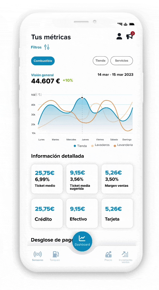
01. Navigable and Intuitive
Create clear navigation through a navbar and intuitive sections, my design aims to offer that agility to the user.
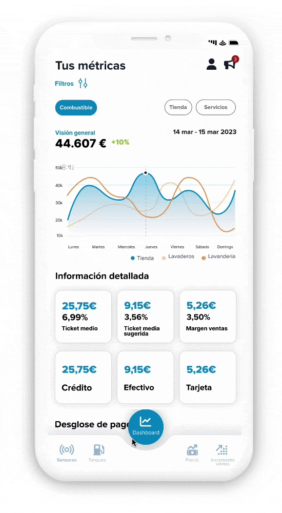
02. Mobile-friendly Design
The design is more modern and attractive, providing a better user experience with a user-centered approach, based on previous research and the preferences of most users.
03. Usable and Accessible
We have enhanced the buttons and data editing features in the design so that users don't feel the need to necessarily use a computer.
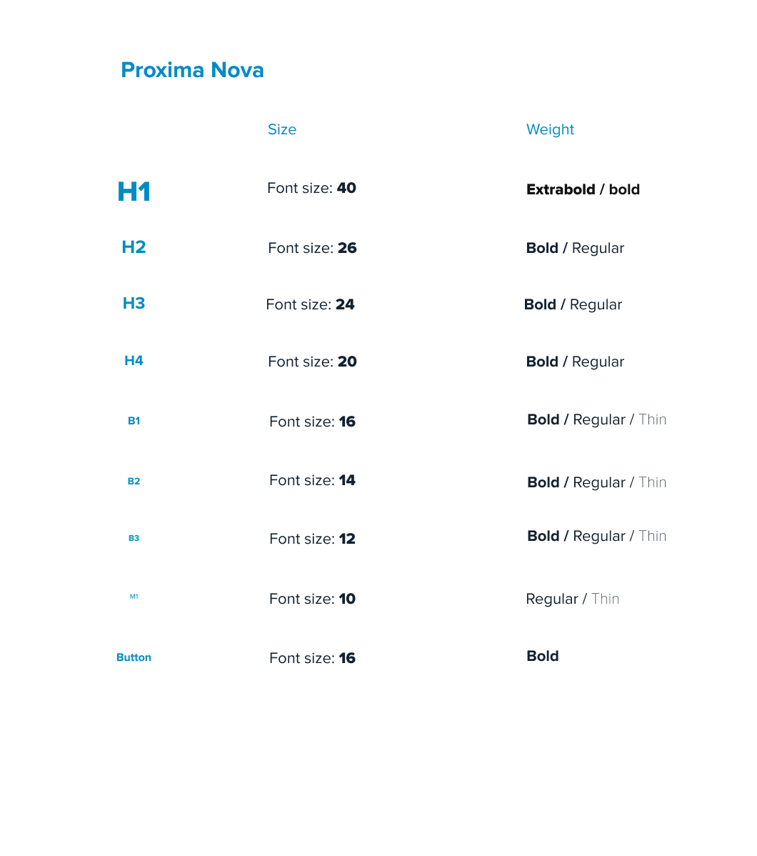
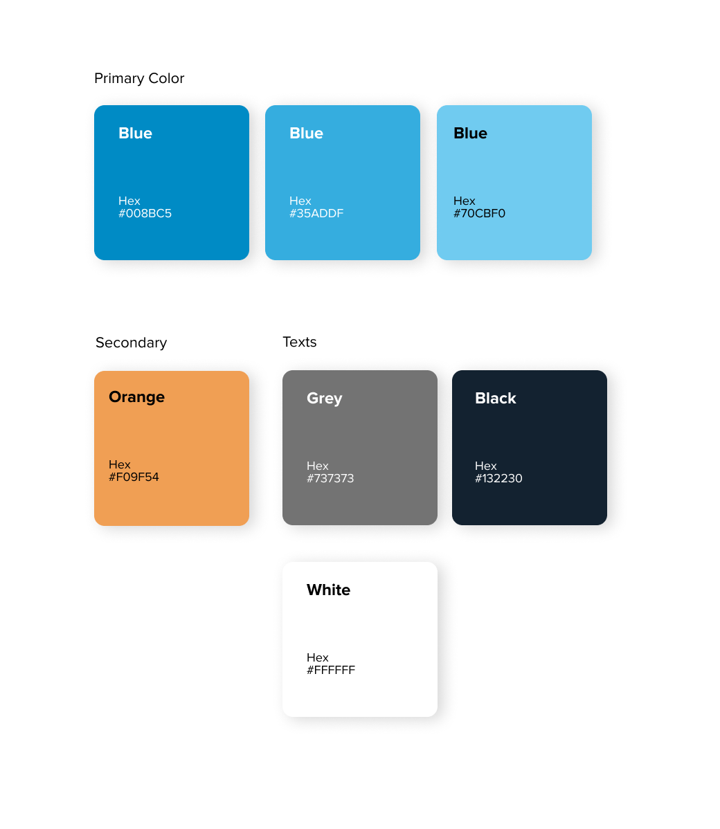
Style guide

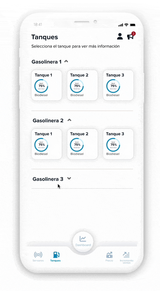
Final UI - Tanques

Final UI - Incremento ventas

Final UI - Dashboard
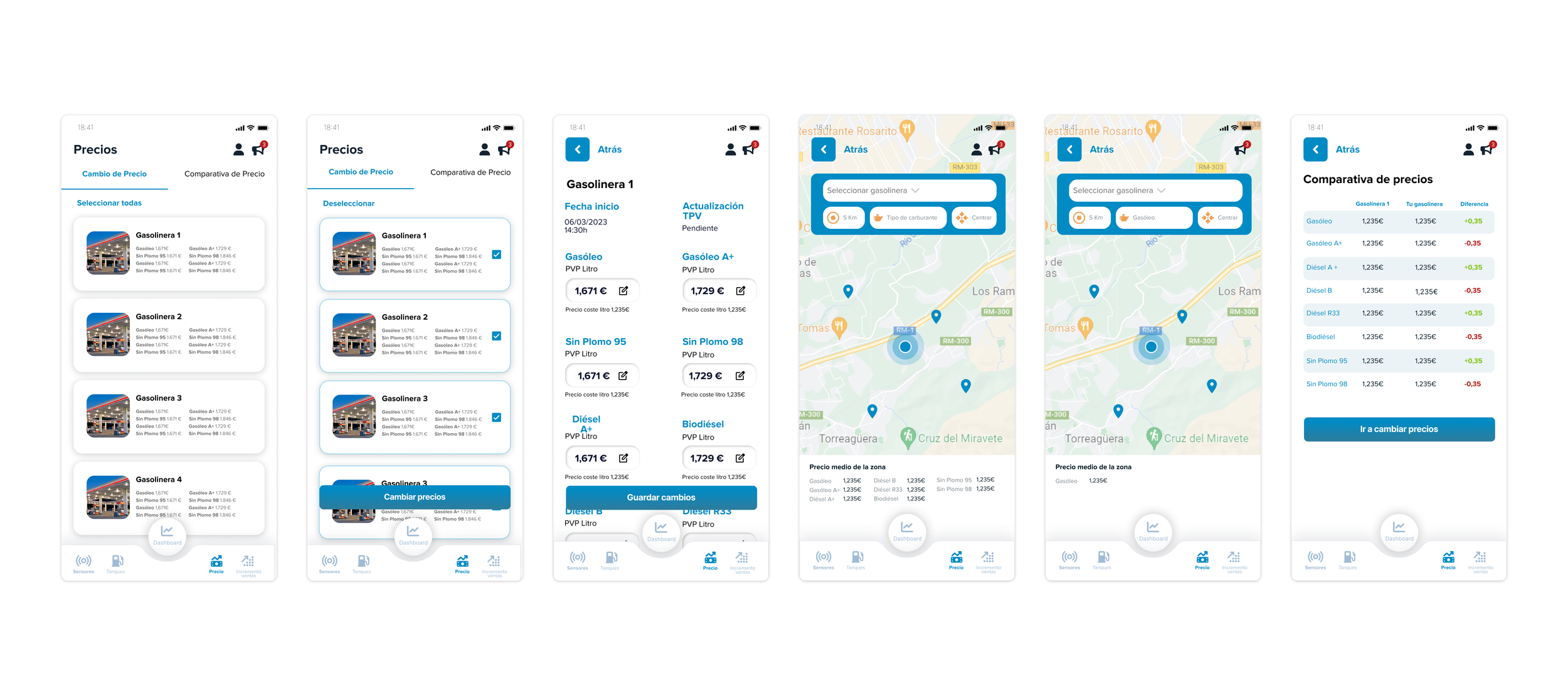
Final UI - Precios