Surfland

UX UI APP REDESIGN

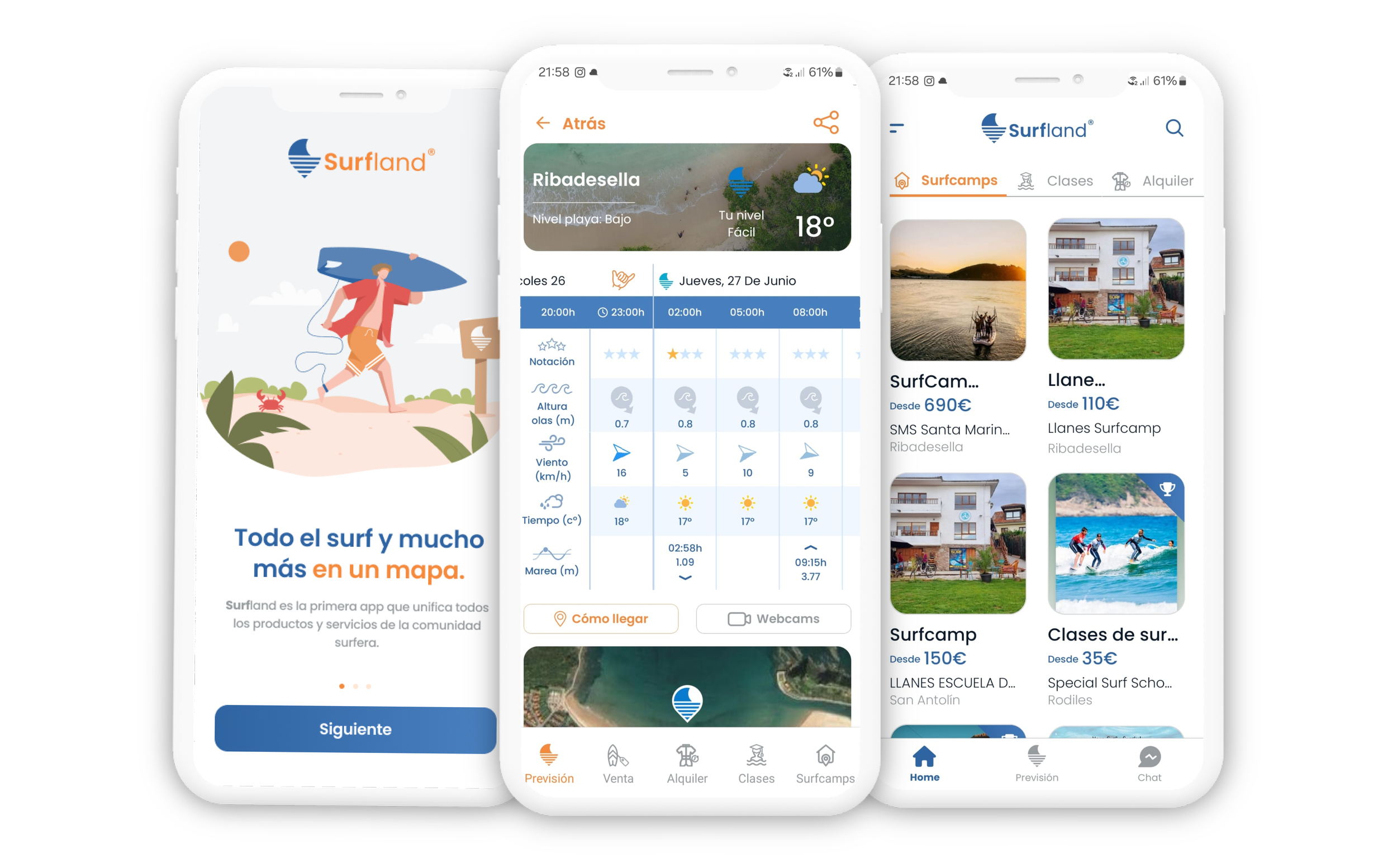
Surfland is a great app for discovering the best places and equipment for surfing. It needed a rework of certain parts of the interface to improve the user experience, and that’s what we did in this update.
UX Design
Role
Team
GooApps
UI Design
Clients
Surfland
Time
2 weeks
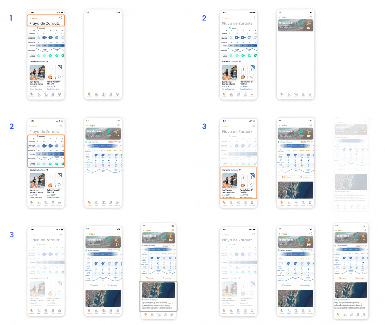
Screen redesign: Beach Weather Prevision
1
We created a better design for the title, with a more modern aesthetic and some information about the surf conditions at the beach and the weather.
We improved the sea information table, keeping within Surfland’s color palette and making it more visually graphic by adding new icons and prioritizing the most important information for surfing
2
We added more information about the beach, removing the beach products because this information is unnecessary and has its section.
3

Old table
New table
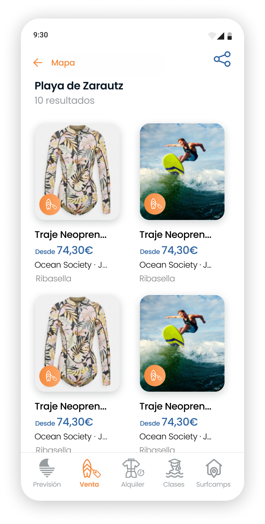
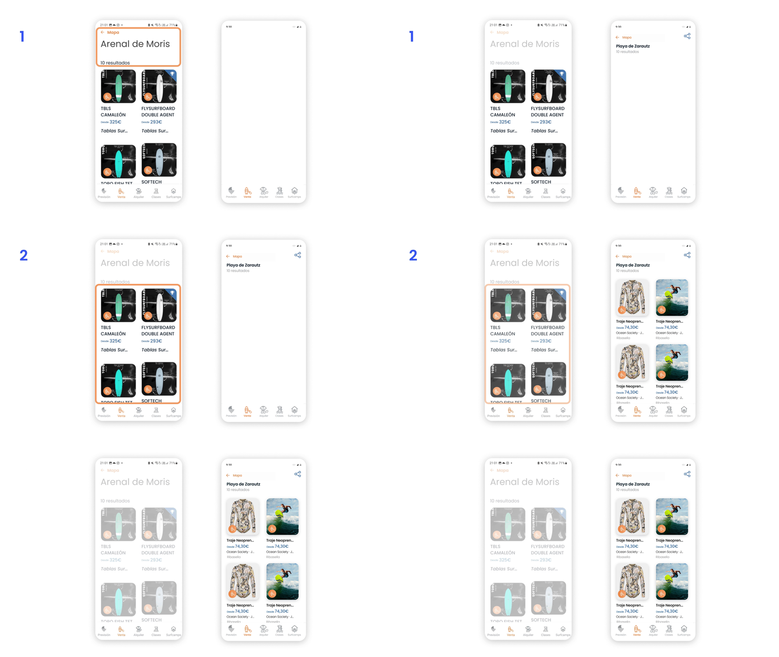
Screen redesign: Store Items
1
We improved the title design, making it more compact and enhancing its hierarchy. Additionally, we reduced the title's space, allowing for a larger area to showcase the product.
2
We redesigned the cards by eliminating the all-caps style in the title. We also added the location and store information, and improved the layout to enhance distances and hierarchy.

Old card
New card
Final UI
